This article is more than 1 year old
Windows 10 on Mobile under the scope: Flaws, confusion, and going nowhere fast
Are you serious, SatNad?
Edge
There’s a new default browser in Windows 10, Edge. It’s the same code as the full fat Windows, but while the desktop version feels very raw and underdeveloped, the phone version is thankfully more steak than sizzle.
Edge gives Windows for phone a big boost. That’s probably because we expect more bells and whistles (extensions, coming, but not here yet, and customisation options) on a desktop browser.
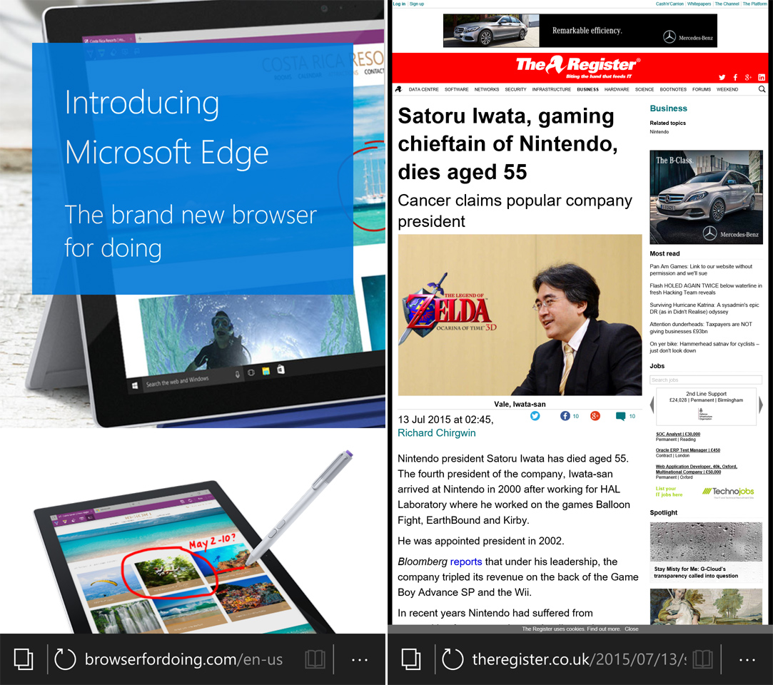
Doing... doing... whuh? Is there a word missing here, Microsoft?
Rather than filling in portions of the page as best it can, Edge seems to render the whole page beautifully offscreen, and after a fraction of a second, drop the whole thing in front of you, even for complex pages. This is very impressive for a beta.
Even at this stage it supports a reading mode and Pr0n, oops, sorry an “InPrivate” mode (which I always thought makes “Pr0n mode” sound even worse).
If only other key parts of Windows mobile were an advance, rather than a retreat.
The biggest hit in daily use over Windows 8 is the new look email client. For years Windows Phone has had a simple but perfectly serviceable email client, and it made good use of the panorama design, so you could swipe over to unread or flagged messages with your thumb.
Microsoft has spent a small fortune (topping half a billion dollars now) buying up immature or barely-there Android and iOS PIM and email apps, and the native Windows mobile app now apes these. The email app is why Windows most feels like an undercooked Android.
Calendar and Email are now called Outlook Email and Outlook Calendar. I can imagine this will cause some confusion. Why? Some normal users who don’t use Outlook, or Outlook.com. will naturally assume this is some Microsoft Outlook-only thing, and go hunting for a Gmail app and be annoyed that there isn’t one, even though Outlook supports Gmail.
Since the panorama design has been discarded, you can do “swipe triage” on each of your emails. That’s fine, but to view unflagged or unread messages now you have to reach for a desktop-style drop-down list box. When it designed iOS, Apple conceded the necessity of multiple-choice controls, but made them easier to use by transposing the options onto a large rotating drum, so your thumb could choose.
But Microsoft uses the fiddly listbox devised in the early 80s for use with a mouse. It’s stubbornly a desktop control, miniaturised. If Windows Phone never existed and somebody wrote a parody of how “Microsoft doesn’t get mobile” this would probably be in it.
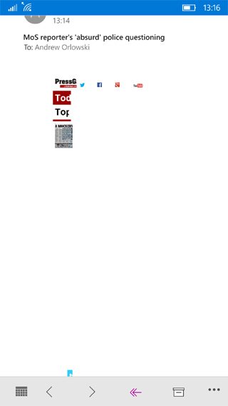
Outlook Email tried gamely to render this HTML email, but gave up and had a sit down
The email app lacks a unified inbox, nor can you pin an account or folder to the start screen as you can with Windows 8 Phone today. Perhaps both flaws will be rectified, their omission is a serious inconvenience.
The useful Family Room features for families, work teams or affinity groups has been killed off, but nothing replaces it. (Yet, anyway). Sometimes rendering was a bit hit and miss too.
As with the desktop, much of the problem lies in a compromised UX, that too often is not one thing or another.
