This article is more than 1 year old
Motorola Moto E: Brill budget blower with one bothersome blunder
Cheap'n'cheerful Android phone – but which one thing drove Reg man mad
Review Motorola couldn't have asked for more from the affordable Moto G. It bumped the company’s UK smartphone market share from next to nothing to 6 per cent all by itself.
For the first time in more than a decade, it gave European stores a Motorola device people actually wanted.

Motorola's Moto E: say goodbye to landfill Android
You could say it saved the company, at least on this side of The Pond. The Moto G most certainly redefined what you could expect from a “budget” Android smartphone. Motorola let me keep my Moto G review handset, and I’ve used it every day since and have not a single bad word to say about the thing.
Motorola’s plans for the budget market are far from done though.
Last week it announced a new budget blower, the £90 Moto E, and an improved Moto G with 4G connectivity and a microSD card slot which is yours for £150. The original Moto G continues to be available but I suspect its days are numbered.

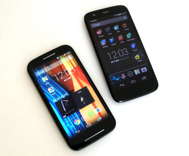
Take your pick: Moto E and Moto G compared
With the Moto E costing £30 less and the new Moto G £30 more, there isn’t really room in between for a third device. Previously, 90 quid would lumber you with a piece of landfill Android offering basic functionality, a stodgy interface and zero brand appeal. So the question is, has the Moto E pulled off the same trick as the G and redefined a category?
First impressions are promising. There's a clear family resemblance with the Moto G as the Moto E is a very solid and nicely rounded, albeit a slightly heavy old Hector. At 142g, it’s only 1g lighter than the rather weighty Moto G. It’s a chunky monkey too. Sure, it's a few millimetres shorter and narrower than the Moto G, but at 12.3mm it’s nearly 1mm thicker. And the Moto G is hardly a svelte device to begin with.

Chunky monkey with Gorilla glass
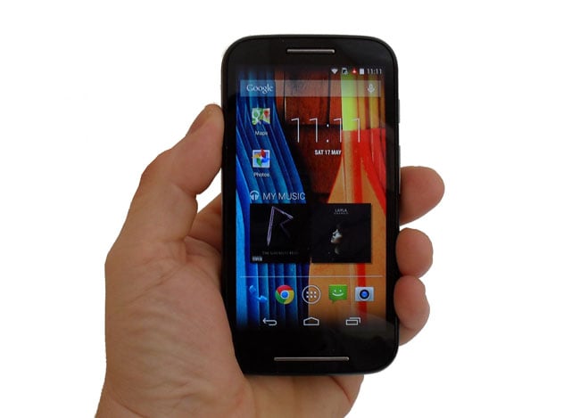
The front of the Moto E houses a 540 x 960, 4.3-inch IPS Gorilla Glass 3 screen with a pixel density of 256dpi. For a budget touchscreen there is surprisingly little chromatic shift when viewed from obtuse angles – it can be seen, but it’s nothing to get bent out of shape over. It’s impressively colourful, bright and sharp with the individual pixels being invisible to the naked eye. In short, it’s an order of magnitude better than you have any right to expect for the money.
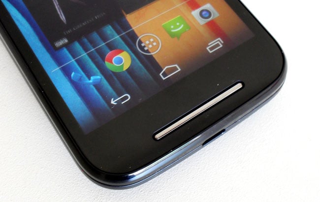
A significant design improvement over the Moto G comes in the form of that thin chrome strip you can see below the screen. It is actually the cover for the E's loudspeaker and an impressive component it is too, appreciably more composed and bass-capable than the G's crude rear-mounted equivalent.

A chrome strip protects the speaker beneath which sounds better than the one in the Moto G
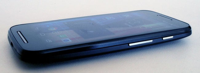
In other respects, the layout is much the same with microUSB on the bottom, 3.5mm audio on the top and the power and volume controls sensibly placed on the right. Apparently, the Moto E is splash-proof, like the G. I’ve not tested the claim in either instance for fear of going beyond the boundaries of "splash".
