This article is more than 1 year old
Amazon Kindle Touch Wi-Fi eBook reader review
Wordy tappinghood
Sixteen shades of grey
On the bright side, the Kindle store does have plenty of free titles available. I even found a freebie offering of my Dad's favourite tome The Men on the Bummel – no sniggering at the back – which managed to procreate to every Kindle app enhanced device I used and proved Whispersync to be a very useful feature.
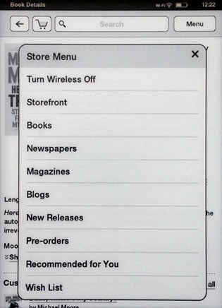
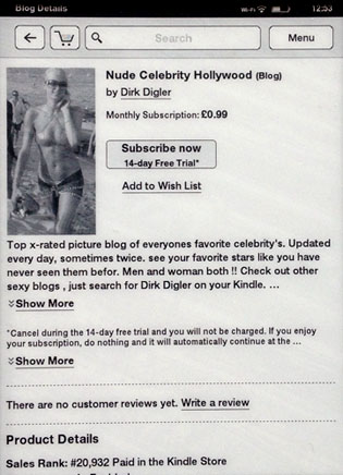
Store menu and dubious blog offering
Checking the categories the Kindle store offers, some of the content seems less enticing with Blogs being offered at 99p a month. One of which, I noticed, is a pic posting site. Unless you've a fad for 1940s-style greyscale glamour, it begs the question why you'd bother.
So when you have finally waded through all this and added enough content to fill up the first page of Kindle Touch’s items screen, you’ll find that, unlike all the other options available, this eBook reader doesn’t show any thumbnail images of the titles. You get eight title listings per page and the usual sort choices, plus folder creation to make Collections.
The listings on the Kindle Touch do look rather drab and I rather miss the thumbnail cover art of my Cybook Odyssey, iPad, iPhone and Galaxy Tab to boot. Considering that this e-reader is called the Touch, tapping on icons is perhaps the most intuitive approach and also provides a tidy way of presenting a lot of content in a limited space. Yet I think this another Amazon mindset issue: you’re supposed to be buying a handful of books and working through them and not looking at content such as PDF manuals, reports and suchlike sourced from elsewhere.
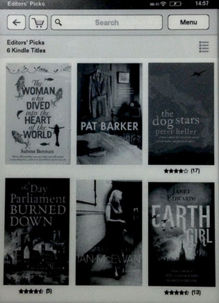
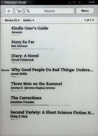
Store Picks has thumbnails but the device listing lacks them
I wouldn’t be at all surprised if thumbnail viewing is introduced in the near future given that all the Kindle software available for other platforms has it. Still, you can look at the cover art but you have to tap the top of the page to bring up the relevant Go To option. Interestingly, this will also show the page number you’re on. Amazon uses Location Numbers which appear somewhat cryptically as say, Loc 316 in one corner and 3% in the other. The idea is to avoid confusion regarding where you are in a book if you change font size.
Considering that I always use the smallest condensed font size and the tightest spacing – all of which minimises repeated page turn taps – I’d rather be confused and have page numbers I can easily remember as a viewing option. Visual prowess notwithstanding, there is a downside to using dense text though. Unless you set the page to refresh with a black flash on every page turn, you’ll get a progressive bleed through of previous pages interfering with the contrast of the text. With larger fonts and bigger spacing, this is less pronounced. Still, there is an automatic refresh every six page turns.
