This article is more than 1 year old
Mac OS X Snow Leopard First Look
Our initial impressions of Apple's new baby
Finder
It's an amazing eight years since we first discussed a truly "native" Finder, one written to the Cocoa frameworks. And here it is.
As you can see, there are no new applications, or even icons. Another reference point, the System Preferences panel, also looks exactly the same as before. If you squint, you'll see Sleep has acquired a keyboard accelerator - Apple add-on keyboards haven't had a power button for a few years now.
Changes are minor, and some improvements are subtle.
Previously, if you wanted to use the fastest method of navigating a folder hierarchy - the old NeXT method that's now called Column view - it would insist on an alphabetical sort order. No longer. Now you can quickly zip through columns listed according to the order that you prefer, by size, kind, date modified and so on:
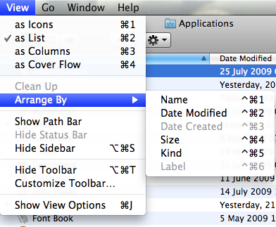
Sort options available in List view...
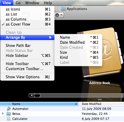
...Cover Flow...
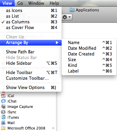
...and Column view
Stacks are gradually becoming regular Finder windows - or more like the old pop-up folders in the classic Mac OS. Stacks open much more smoothly and reliably in Snow Leopard, and are scrollable.
In Finder windows, you can magnify the icons up to 512 pixels. Now why would you want to do that?
Because you're a weirdo. For fans of icon porn, a closeup looks like this:
So far, so useless. Where it might start to get useful is when the icon is more than symbolic representation of the data, but a document preview in miniature. Such as here:

A PDF (but not RTF) document can be browsed at this magnification too, page after page - the icon gets forward and backward arrows:
I've mixed feelings about all this. I find that a desktop full of document 'miniatures' to be inefficient: the icons are hard to distinguish, not least because desktop icons are limited to 128 pixels. It was much easier in the old days, when you were forced to read the filenames. And, even at 512 pixels, it's almost impossible to read the contents of a document that's primarily text, especially on larger monitors.
Click to see the 512 x 512 icons - well, except Opera's...
Then again, it doesn't matter, because of Leopard's terrific preview feature, QuickLook. This has saved me more time than any other addition to the OS last time around, and the 2009 version has been accelerated noticeably.
So it's all a bit pointless today. This kind of thing will possibly useful down the line when pixel densities are higher, perhaps, but not just now.
