This article is more than 1 year old
Canadian uni catches the rebranding sniffles
Revolting students protest 'new marketing-oriented visual identity'
LogoWatch Canada's University of Waterloo has caught a light case of the rebranding sniffles, having decided to flush its old brand frontage (left) down the toilet of history and unveil an exciting "new marketing-oriented visual identity" (right):
![]()
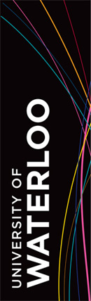 To give students a taste of the coming revolution, the uni is this week unfurling a few banners (see pic) which Meg Beckel, vice-president external relations, described as "transitional".
She explained: “We are not using the new logo, but we are introducing elements of the new visual identity: the Gotham font, the bolder look, and the colours. This is an evolution, not a revolution. We are gradually getting the new look out there, testing it and playing with it.”
Lovely. Well, sort of lovely, because according to one student who got in touch with El Reg, the redefined academic logo paradigm has not gone down well with the unwashed masses.
Indeed, revolting alumni have manned the Facebook barricades* en masse to protest a logo they "do not believe ... represents UW's prestige and degree of professionalism properly".
Entertaining stuff. The rebels are apparently locked in tense dialogue with management, so we await the outcome of this rebranding struggle with interest. ®
Bootnote
*Kids of today, eh? Now, when I was at uni, we hit the streets in Che Guevara t-shirts, overturned cars, battled riot police, torched banks - and that was just because they'd raised the price of beer in the student union bar by two pence.
