Original URL: https://www.theregister.com/2011/06/08/a_beginners_guide_to_windows8/
Win8: A beginner's guide to FondleWindows
Tiles for fat fingers, drag 'n' snap, but no meta-widget ambitions...
Posted in Software, 8th June 2011 11:22 GMT
Microsoft has unveiled the biggest design changes to Windows in the past 15 years, and probably the biggest redesign in its 26-year life. There are also implications for Windows developers – many of you will soon be obliged to learn the Ways of the Script Kiddie. These are huge changes and you should have a look yourself.
What follows is an opinionated summary of the most important bits. Microsoft's codename for Windows 8 is er ... "Windows 8", which gives Redmond the option of calling it "Windows Mayan Apocalypse Edition", or some other brainstorm from their strategy boutique. But it's unavoidably going to be called, now and forever, FondleWindows.
The new start screen is exactly what you'd expect: a Windows Phone7-style finger UI, with more tiles, as befits a slate or laptop with a touch screen. And extensive use of that OVERLARGESegoe font.
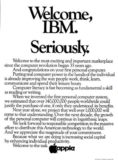
What Microsoft has done with its new look 'n' feel is add a new windows manager, which encapsulates old-style applications. New applications are designed for a direct manipulation touch UI, and can be written using HTML and Javascript. The design borrows heavily from the iPhone's system, iOS, also used for the iPad. Cue grumblings that Microsoft has ripped off Apple again. These are justifiable, and I can imagine Apple placing a "Welcome, FondleWindows. Seriously." ad in the papers, just as it welcomed IBM in 1981 and Windows 95 14 years later. It looks peevish, though.
Once you have a decided to create a direct manipulation UI, there just aren't a lot of different ways of do things. You can have different gestures, and put the buttons in different places – but they're going to look 'n' feel pretty similar – just as what were once called WIMP (Windows Icons Pull-down Menus) user interfaces were all really fairly similar.
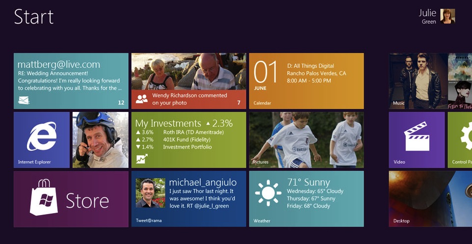
"Tiles are better than icons," insists Microsoft's Jensen Harris in the introductory video, which you can skip to below. But that's only true for some things some of the time. It's true for things you need to monitor. But there are many other times, for example when you just want to import and review some photos, or crank up a music program, where this information is superfluous. All you want is a nice big icon to slap. The rest is superfluous, information-for-the-sake-of-it stuff that's a sign of social-media-itis.
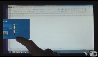
Task switching is achieved by dragging from the edge to the middle of the screen, which is nice and simple. An equally simple gesture snaps windows next to each other.
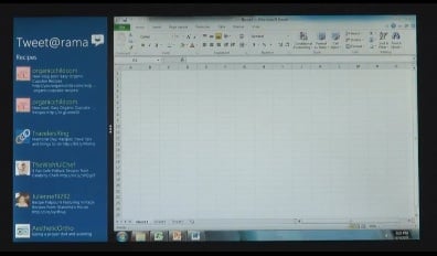
What world+dog currently recognises as a Windows app effectively becomes a "WINOLDAP" – which if you remember, was Microsoft's cute term for DOS apps running under Windows. It runs alongside the new style apps and can share screen space with them, as we see here.
This immediately raises some questions. While Microsoft insisted this week that "it's not two shells", it is still two radically different input methods and designs. Input methods and applications are still things that come between you and your data.
Two thumbs are better than...
The new apps are obviously designed to be used with a fat finger, on a conductive screen. The old apps are best used with a mouse, or at least, a complex set of key combinations. And obviously there's a level of indirection – you use a tool to steer an intermediary (a mouse cursor or caret) to a point on the screen, which might be another intermediary (such as a scroll bar). Direct manipulation interfaces don't: if you want to scroll down, you push the page down. So at what point does a mouse become necessary?
In Microsoft's first demonstration of FondleWindows, office applications are OLDAPs, and haven't been updated to the new design. But we already know what they'll look like, as Office 15 too uses the WP7 look. That doesn't tell us how it will feel – since it's a cosmetic, WP7-style makeover. How it will work in a finger-friendly, direct manipulation UI is anyone's guess at this stage.

Leaked screenshots show Office 15 gets lots of white space. Pic: winrumours
As even the iPad's biggest fans might admit, while it's a terrific viewing device, for office work it's actually a sub-optimal UI, for now. Nothing beats a mouse and a rich UI designed for a mouse. I can't see anyone on a Fondleslab (of any kind) matching a laptop Office user for "productivity". (I use scare quotes because a lot of Office work is non-productive – but you get the point.)
Microsoft is dealing with this challenge by ducking it – and I can't blame them. "There's a lot of utility in Office," said Julie Lawson-Green in the debut demo this week.
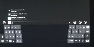
One nice feature is that as well as the usual QWERTY, you can use a "thumbs" keyboard.
You can watch Microsoft's official video here:
What's missing? Quite a lot actually, but to be fair, the beta is still at least three months away and release isn't expected until next year. That's an optimistic view – remember Windows 8 is also the first port of the codebase to ARM processors.
Apple is well ahead in the game of adding touch elements to Mac OS X. What's missing from both giants is ambition, it seems: the ambition to do more than add a few new widgets, and some funky window manager effects to a new OS release. Whatever happened to the idea of the file system as a database? Or new ways of organising and browsing data – such as piles?
Did the derision that greeted Microsoft Bob permanently dissuade system vendors from ever trying to improve organising and finding data? I hope not. But I'll follow up this strange lack of innovation into the next article. ®