Original URL: https://www.theregister.com/2011/04/12/nokia_symbian_anna_e6_and_x7/
Nokia gets touchy-feely with two new Symbians
A brilliant business QWERTY, and a Gothic nightmare...
Posted in Personal Tech, 12th April 2011 11:10 GMT
Nokia says it wants to sell 150 million Symbian phones before the venerable OS is finally shunted off to the knacker's yard, and it unveiled two new models today that the Finns hope will bring that target nearer. Both feature a new "Anna" revision to Symbian OS.
One model, a Blackberry-like business design, is quite outstanding and reminds you how good Nokia can be when it pulls everything together. The other, a large touch screen consumer model, the X7, makes the 150 million target look very distant indeed.
We had a hands-on with both this morning.
The good news first.
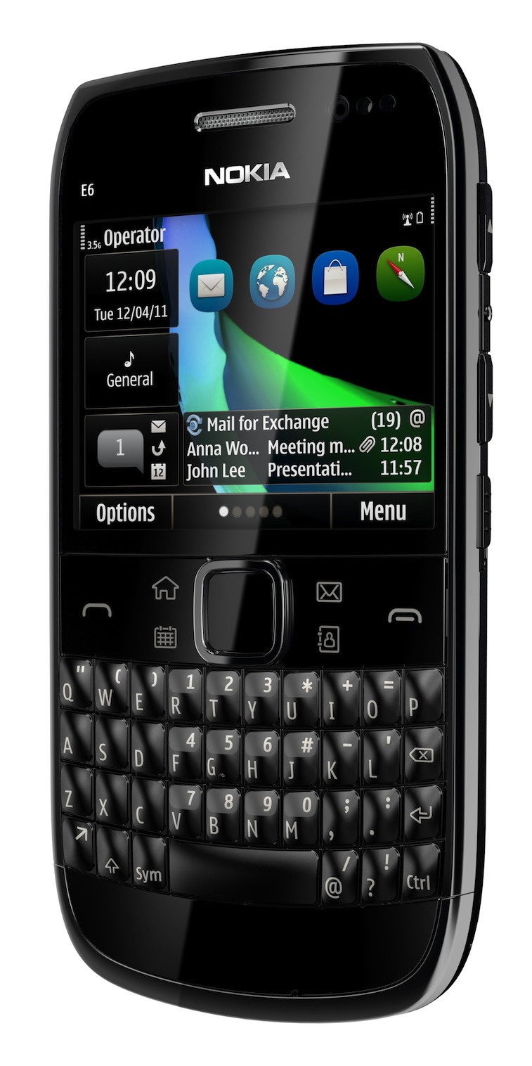
Nokia E6 [click to enlarge]
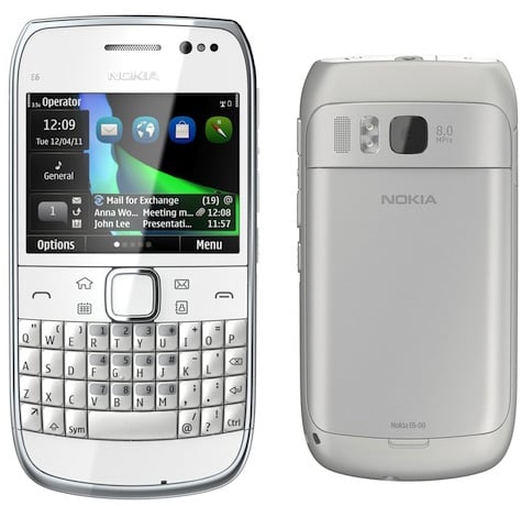
Launched in 2008, the E71 was one of the best and most successful Nokias in recent years, and still fetches a premium. Complimented for its excellent build quality, size, finish and battery life, here was a case of Nokia executing well. Its successor, the E72, gathered more complaints than plaudits. The E6 adds a touch screen, and this works so well in practice you wonder why it wasn't done years ago. Everything is more accessible, which goes some way to remedying one of the most notorious usability problems with Nokia's S60: phone settings are sprayed all over the place. As with its predecessors, it makes rivals from RIM look heavy and bloated. It's actually 133g, considerably heavier than the Blackberry Curve 9300's 106g, but being a couple of millimeters thinner than the RIM, it feels more comfortable.
The E6 also touts a higher density 640x480 screen, and at 326 pixels per inch, it's pin sharp, and doesn't appear to suffer from the added digitiser. Media capabilities have been pimped up to handle video recording (and playback) at HD 720p, and take 8MP pictures. There's an FM radio built in. Nokia claims figures of 14.8 hours talktime on GSM and 7.5 hours on 3G, with a month's standby time – thanks to the now-familiar 1500 mAh battery. As with the over-sized QWERTY slider the E7, 802.11n-speed WLANs are supported; as is the 1700Mhz 3G frequency used by T-Mobile USA, alongside the 1900Mhz (North America) and 2100Mhz (everyone else) frequencies.
The new model supports more Microsoft enterprises services than before, including Sharepoint Server, and better exchange support. This was promised in 2009, with Microsoft's Stephen Elop helping engineer a pact. I wonder where he is nowadays?
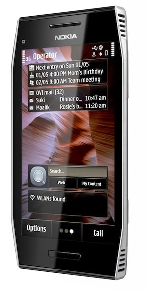
The X7 is a head-scratcher. It's been given the Gothic styling beloved of hardcore PC gamers, but the specs don't command a premium: a 4-inch OLED screen is now bog standard, only this 4-incher can't do more than the sub-par 640x360 display resolution. The 8MP camera is also fairly routine now. This only emphases the Noddy&trade feel of the new icons – more of this below. And while you may be fooled into thinking it pumps out quadraphonic sound, or even stereo, there is merely a feeble mono speaker.
Echo, echo, echo...
There are strong design echoes of this Siemens phone – which was also a Symbian device ... and was not a great success. Although that keypad can't have helped, there.
"There's nothing like it on the market," Nokia said today, referring to the X7. "There are whole swathes of black boxes out there with touch screens." But the X7's styling isn't special enough to stand-out, and is likely to repel as many potential customers as it attracts, while the software lets it down. How Nokia thinks it can command a premium pricing of €380 is beyond me.
Both are due in Q2, the E6 with a price of €340.
The new 'Anna' release of Symbian sees another new icon set, also from Nokia's London design team, in the now increasingly deserted Great Pulteney Street complex.
This one reduces all the previously distinctive shapes to a lozenge-shape, and looks very similar to the new Ubuntu Unity Dock. On the 4-inch X7 screen they're gigantic. The major criticisms of the previous design is that they were toy-like and didn't differentiate between folders and applications. The new set doesn't do anything to address either criticism.
You are in a twisty grid of icons... all alike
Other changes include a portrait QWERTY keyboard (a huge omission from earlier touchscreens), and the ability to see what you're typing in context. Previously, you couldn't – so if you were typing a CAPTCHA you had to cancel the text you had input and find a piece of paper to write it down on. Anna also has a slightly improved web browser, based on existing code. It certainly feels fast and usable, although a little sensitive to the touch.
The changes will be rolled out to existing N8, C7, C6-01 and E7 customers as promised.

Alas, the new corporate font wasn't ready in time. It will be rolled out across the new phones (and investor relations statements) throughout 2011, we're told. ®