Original URL: https://www.theregister.com/2010/10/21/winphone7_review/
Phone 7: Another Vista or another XP?
We scratch beneath the surface and find a bit of both
Posted in Personal Tech, 21st October 2010 10:11 GMT
Review We've been playing with a Windows Phone 7 device for a week or so now, and have been surprisingly impressed with the detail, though sadly disappointed with the bigger picture.
Microsoft has put a lot into Windows Phone 7, and plans to spend a fortune developing it, but while the interface and functionality has a host of beautiful touches - from the dots that fly around the place showing activity, to the elegant animations bringing a minimalist interface to life - the whole fails to satisfy entirely and one can't help feeling there's still a lot of work to be done.
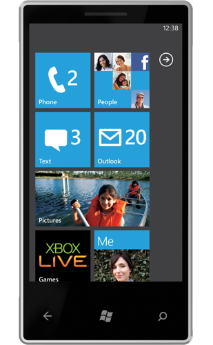
Microsoft has spent a great deal of time making sure its baby gets everyone's attention; reviewers were required to attend a half-day briefing to ensure they understood the motivation behind every nuance of the interface. Just in case they dozed off, MS helpfully provided a 107-page reviewers' guide. One can hardly fault a company for providing dedicated support, but it's indicative of how important it is to Redmond that Windows Mobile 7 is loved by all.
And there's a lot to love, with applications heavily integrated and tied (or locked) to cloud services from Microsoft and its partners. But before we get into the interface and what's behind it, we'll start with the hardware, which is mandated on every Windows Phone 7 device.
The Hardware
Every Windows Phone 7 must have three buttons on the front, providing Back, Search and Start (which means Home, but Microsoft insists on calling it "Start"). Back and Search are context-sensitive, but Start always takes you back to the tiled home screen.
On the side are a couple of volume keys and a camera button as well as a power button. The latter two are dual-function: tapping on power button either locks or wakes up the phone, half pressure on the camera button starts the camera focusing, while pressing fully takes a snap.

Microsoft makes much play of the camera button; every phone will have at least five megapixels and a flash, and pressing the hardware button at at any point causes the camera to jump into life regardless of what else is going on - even if the phone has been PIN locked, though you'll have to unlock it before you can save the photograph.
Manufacturers are allowed to add a keyboard, but that's about all the innovation that's permitted. No additional buttons, and no removable memory either - Microsoft reckons it complicates things - so any differentiation is going to have to be in software, and not a lot is allowed even there.
Step into my world
The whole premise of Windows Phone 7 is information at a glance. The idea is that important information is already on the screen, so you don't have to muck about opening applications and searching for stuff. That's a good premise, and works to some extent, as long as your idea of important information matches Redmond's.
Starting with the lock screen, which shows your next upcoming appointment as well as the traditional time and date, something that has already proved useful when trying to remember where we're going. That lock screen will also show music controls for a few seconds if there's music playing - so you can pause, skip track or replay without even unlocking the phone.
Once you slide the lock out of the way you get to the home screen, which Microsoft insists on calling "Start", to blend identities with its desktop OS.
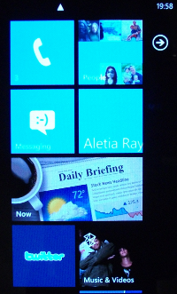
The tiles slide up and down, and there's a boring old list of applications to the right
Out on the tiles
Those tiles are supposed to be superior to icons, and not only because they're bigger. The idea is that they display contextual information based on the applications behind them, pushing the idea that important information can be seen at a glance rather than having to open applications. The only problem is that most of them don't, and those that do don't always make it clear what they're displaying.
The Phone tile, for example, shows missed calls and voicemail, only the simplicity of the interface makes it unclear which is which. I know that I have three, but three of what remains a mystery. That's probably something one would get used to, and at least it's not presenting information for the sake of looking busy, like the "People" tile.
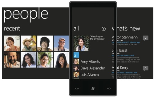
When tapped, People takes you into your contacts lists, populated from your favourite social networking site (as long as it's Facebook) - which we'll talk about later - but the tile itself displays rotating images related to your contacts, apparently at random. For a while we thought it might be related to when they update their status, but no - it seems the ever-changing display is simply eye candy designed to remind you how popular you are (or not).
A messaging tile shows you incoming messages awaiting your attention, but that's SMS messages only, as each email account gets its own tile and there's no universal mailbox here.
The next tile in our screenshot is one pulled out of People that represents a single contact, one of particular importance. This time you will get status updates scraped from Facebook and displayed on the tile, with pictures too.
The Daily Briefing tile is typical of the missed opportunities - tap on it and you'll get local weather, news and financial information, but despite being double width (a privilege Microsoft reserves for itself and chosen partners) the tile shows no information at all - rather defeating the object of the interface.
Equally useless is the Twitter application, which couldn't update even if it wanted to as third-party applications aren't allowed to run in the background (again, that's reserved for Microsoft and its preferred people), so tapping on Twitter leads to a wait while the client updates itself.
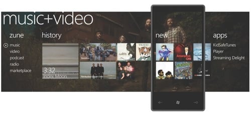
But that's in stark contrast to the Zune tile, which shows what the interface can do by automatically showing an image related to the last track played (album cover or just an image of the band) and taking the user into the Music and Video hub, which is the most impressive of the hubs that form the rest of the interface.
Take it from the Zune
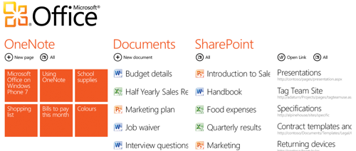
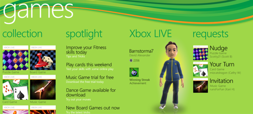
Hubs are interfaces made up of multiple screens, arrayed horizontally, and one scrolls back and forth by sliding a thumb across the screen. Each screen extends slightly into the neighbouring screens, and consists of text menus or more tiles. Third parties are encouraged to put other things in there, as HTC has demonstrated with massively over-the-top transition animations, but it's the only place where manufacturers, and operators, are free to express themselves. Microsoft uses the same paradigm in email, for moving between mailboxes, and elsewhere, but the best example is the Music and Video hub.

It sure didn't sound like Alanis Morissette
Unlike its predecessors, Windows Phone 7 won't mount as a USB drive, taking its lead from the iPhone it will only integrate with Microsoft's desktop software, Zune. The Zune software does a decent enough job of imitating iTunes, though it won't synchronise your address book or diary - that's a job for the cloud - but it will sell you music and keep track of what you've got installed.
Once your media is on the phone, you can easily browse through it using the hub interface to navigate between the recently played, newly installed and media menus, the latter allowing one to navigate between albums, tracks and artists in another hub interface.
The same approach is used for everything from navigating between email boxes to browsing SharePoint documents, and works pretty well. Taking its cue from the iPhone, there's no option to pull up a menu at any point, which left us scratching our heads more often than one might hope.
Windows Phone 7 likes to link things together, so tap on a contact and you can see their latest status, and write on their wall, as well as the more-mundane phoning and email. But that level of integration means specialisation, so you can only write on a Facebook wall, not post a question to LinkedIn or update a status on Orkut - and don't expect to see a contact's IM status appear in their profile. Microsoft says it will add other services, but it won't provide APIs for anyone else to do so as that would be mean letting them run background tasks - which isn't allowed.
Microsoft is allowed to do that, of course, so music happily plays in the background, and the People hub runs around updating Facebook profiles and synchronising contacts and diary with anything that supports ActiveSync - including Google, so background processing is very much part of the model, it's just that only Microsoft can be trusted to do it right.
But if you do use Google for your data, have an active presence in Facebook and are prone to the occasional tweet (@bill4000, thanks for asking) then the phone works. And as that probably includes a significant proportion of the population, then Microsoft could be onto something.
Once we'd settled into the lack of menu, and the fact that the Back key is on the opposite side from the Android handsets, then the phone is quite usable - Office documents can be edited, music plays and the browser is stunning.
Exploring with Internet Explorer
Microsoft's web browser deserves a special mention, as it's faster and more responsive than any of the competition. Pinch to zoom is supported, but mostly one just taps to zoom in and out, and the speed with which it loads and renders pages is directly comparable to a desktop computer. Few sites recognised the browser as being mobile, so in most cases we had the desktop site that worked perfectly on the diminutive screen.
Flash isn't supported, and won't be anytime soon, but neither is SilverLight (Microsoft's answer to Flash). We're told that YouTube videos will work, and that a YouTube client will be triggered by clicking on an embedded video in a website, but on our handset that wasn't working.
It would be nice to think that other applications might be integrated in the same way - triggered though a website link, but apparently that's not the plan. Better functionality is reserved for Microsoft and its buddies.
The Final Call
Microsoft has achieved amazing things with Windows Phone 7, and some of the details are beautifully executed, but the platform is far from perfect. When the handset was first issued, the Microsoft staff spent more than half an hour trying to get it working with The Register's email system, partly thanks to some dodgy hotel Wi-Fi, and partly down to the way we run our email system - but mostly the time was taken up looking at a mailbox that blithely claimed to be empty and refused to admit anything was wrong. A couple of error screens and we'd have been sorted in half the time, but Microsoft hates to display error screens, so Windows Phone 7 doesn't show them.
Even now the mailbox integration is far from perfect, working perfectly with an IMAP account but unable to tally with the contents of a Gmail box, for reasons that remain obscure.
This is all a shame, 'cos the animations and thumb-driven interfacing really is very impressive and makes the handset pleasant to use despite its complexity. The tiles need to be more interactive to justify their existence, and what bugs there are need addressing, but in a year or two Windows Phone 7 could be a very impressive platform.
But not yet. ®