Original URL: https://www.theregister.com/2010/10/11/hands_on_windows_7/
Hands on with Windows Phone 7
More a re-skin than a re-invention
Posted in Personal Tech, 11th October 2010 18:02 GMT
Analysis Will Windows Phone 7 succeed? That's difficult to say, but Microsoft can at least claim that it has come up with something different.
Not very different, mind. WinPho 7 isn't the radical departure Microsoft might want us to think it is, but it is a refreshing alternative to the apps'n'icons approach its rivals have taken.
In that respect, WinPho 7 owes more the Palm's WebOS than to either Apple's iOS or Google's Android. There's a much greater blurring of the lines between apps, services and data than there there is on the latter platforms, and, like WebOS, it puts social networking and email accounts on a par and at the heart of the system.

No Facebook account? Your 'What's New' panel might be rather empty...
The downside here is that if you're not an avid Facebooker and you don't own an Xbox, you probably don't care about any of this. And you'll notice some big, empty gaps in WinPho 7's "hubs", the zones in which the OS groups related data and services.
The Photos hub, for instance, has an area headed Latest News which presents uploaded and shared snaps for your social networked chums. No chums - at least none you follow online - no pics.
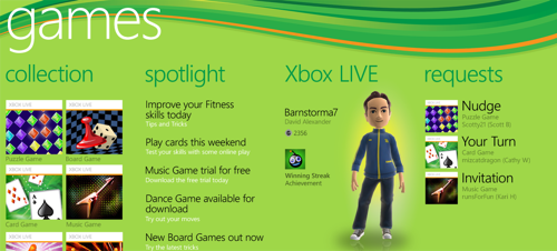
Hubs comprise a large area with the screen showing just a portion of the whole. You swipe left or right to move on to the next part. It's a novel idea that dispenses with the notion of a screen as a menu containing iconic options you can tap.

Tiles may contain at-a-glance info, but they're large and you'll still be scrolling a way to get to the distant ones.
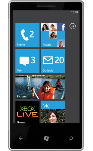
The main screen is slightly more traditional. It comprises a sequence of half- and full-width "tiles" - dynamic icons that take you to hubs, to apps, to services and so forth. The dynamism comes through tiles' ability to present information and keep it updated: pictures of contacts on the recent but missed call list, for instance, or upcoming calendar appointments.
All this contributes to Microsoft's goal of presenting data in an 'at a glance' form, which again is a notion that informs the design of WebOS and its use of notifications - one of the few ways in which the Palm product is superior to iOS.
Incidentally, Microsoft calls the home screen "Start", a nod toward the Windows and a UI with which WinPho 7 - despite the name - has nothing at all in common. Branding aside, WinPho 7 has less in common with Microsoft's desktop OS than iOS has with Mac OS X.
Tiles'n'hubs = icons'n'apps
Apps can be added to the Start screen, moved around within it or dropped from the list. An right-facing arrow on the right of the Start screen takes you to a list of apps installed on the smartphone. Press and hold any one to get a pop-up menu from which you can uninstall third-party apps, or pin them to the Start menu. Microsoft apps can't be deleted, but I was able to remove one of the Orange-installed tools.
Click and hold an app in Start and you can then remove it from the screen or move it. It works like iOS but without the 'wobble'.

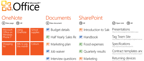
Not just for consumers: Office and Exchange are well supported
The fact is, of course, that WinPho 7's tiles are app icons, just ones that can operate not merely as app identifier but as one of the app's data display mechanisms. The hubs are apps with clever, big, widescreen UIs, but apps nonetheless. If an app doesn't present information in its tile, you're just as far away from the data as you are with an iOS or Android program.
The question is, do punters want a variety of similar but different UIs that reflect the data or services they are viewing, or do they want to keep apps separate? iOS' fast app load times - improved further with iOS 4's multitasking - mean that you're actually never that far from the data and services that matter to you.
WinPho 7 claims to bring these closer to you, but you can still be a tap and a swipe or two away. Hubs may cleverly personalise themselves for you - primarily by using your own snaps as wallpaper - but the OS' animated graphics are no less gimmicky for all that. You still need to go into the Settings zone to connect to a Wi-Fi network. Messages appear as IM-style conversations. Big tiles mean you only get eight per screen, so you'll be swiping down to other 'pages' as much as you do on the iPhone or an Android device - you just go up and down instead of side to side.
So WinPho 7 doesn't reinvent the smartphone OS so much as re-skin it.

An app with a big, wide UI that's larger than the phone's screen - but still an app
I'm sure both Android and iOS will learn from the WinPho 7 - iOS desperately needs a better notifications system, for example - but there's nothing here that will have Google or Apple worrying. But if they think Microsoft would never be able to rise above Windows Mobile 6, they're wrong.
WinPho 7 comes into a crowded market, and it's certainly not going to dominate. But it might just help prevent one of the other operating systems gaining the foothold that Microsoft's other OS, Windows, gained in the personal computing space. And if it does so, that's all to the good, I think.
The irony that that might be a Microsoft product that blocked a monopoly will be lost on no one. ®