Original URL: https://www.theregister.com/2008/07/11/wired_competition_gallery/
Reg readers kickstart WiReD UK recovery
And the winner is...
Posted in Legal, 11th July 2008 13:02 GMT
Competition So WiReD magazine is returning to the UK next year, after an 11 year absence. The very idea of "a UK edition of WiReD" is as strange as one of those creepy medical experiments where boffins graft an ear onto the back of a mouse; but you have to admire the suicidal determination of the publisher, Conde Naste.
Last week we challenged you to imagine what this strange creature might look like. You've risen to the challenge in fine style.
So sit back and enjoy - WiReD UK - as imagined by Reg readers.
To kick us off, here's Matthew Calamatta's fine suggestion:

And kudos for Matthew Yee-King for making no sense at all. Authentic!
Ian Silverwood deserves credit for resurrecting the icon of Web 2.0 in his submission:

While Madra resurrects the Eee girl (Mk One)
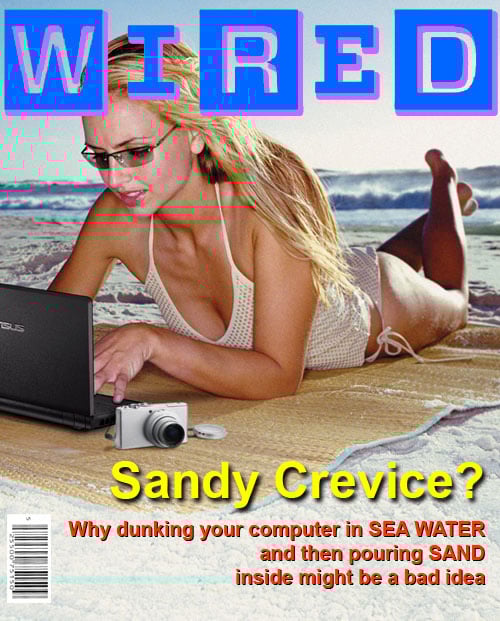
Seriously, though: if WiReD is to have a snowball in hell's chance of avoiding the fate of Mark One - it's probably going to need to look alot like that. So hire that Madra.
"Not that I am at all cynical about the relaunched Wired's chances," writes Mark Chapman.
Harsh. Very harsh.
A.Milnes should have been disqualified for blatant sucking-up to Reg hacks, but in the end we gave him the benefit of the doubt and decided he was being sarcastic.
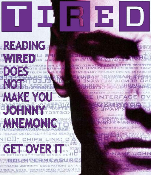
Chris Johnson captures the spirit here:

While Oliver Johnson goes for replicating the Look n'Feel, correctly surmising you can put any old toss on the Front Page there if the font looks funky:
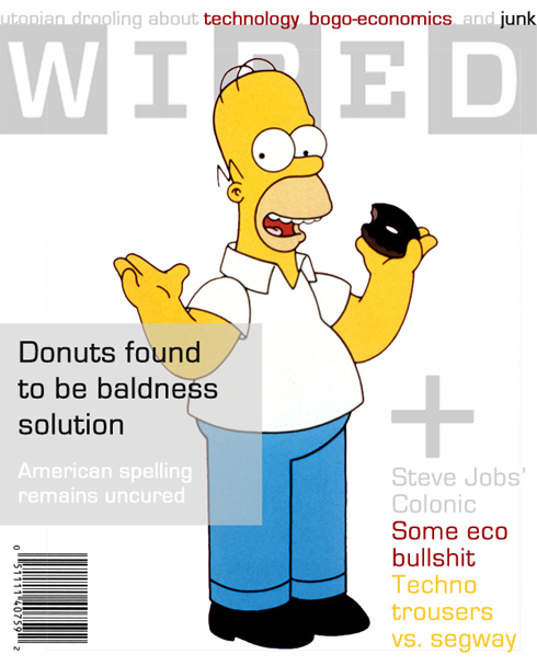
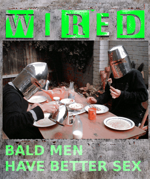
There were a couple of takes on a historical theme. Michael Paxton's gag-packed effort won a lot of admiration in the Reg office, and repays the time spent trying to read the text in those dayglo colours. Unlike the original mag:

Jim Price suspects WiReD will be co-opted for propaganda:

But there's more...
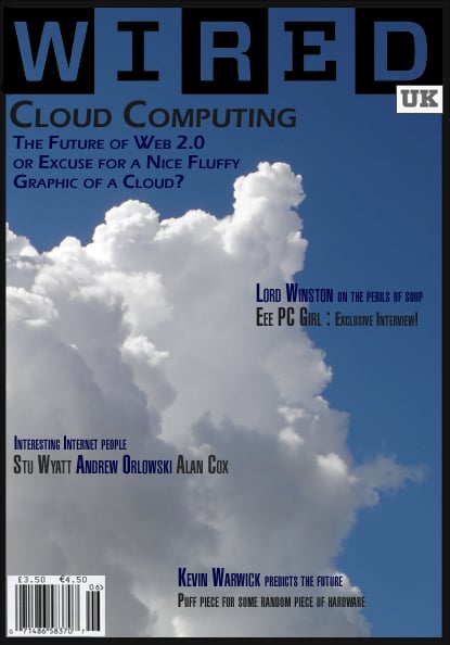
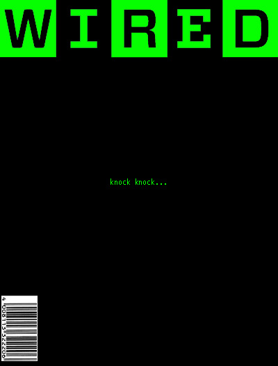
Simon O's submission is probably the most realistic:

While Phil Hare writes:
"I'm not lazy; I just couldn't think of anything that represents the return of WiReD better than this. It works on so many levels. And maybe I am a bit lazy."
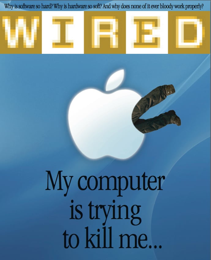
John Morton offers a cry from the heart:
While Dave #2 submitted this sterling effort:
But it's now time to unveil the winner...
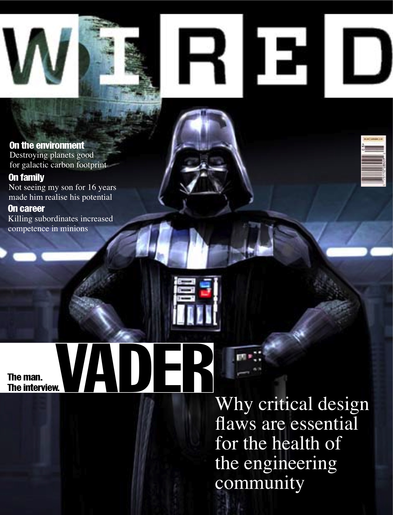
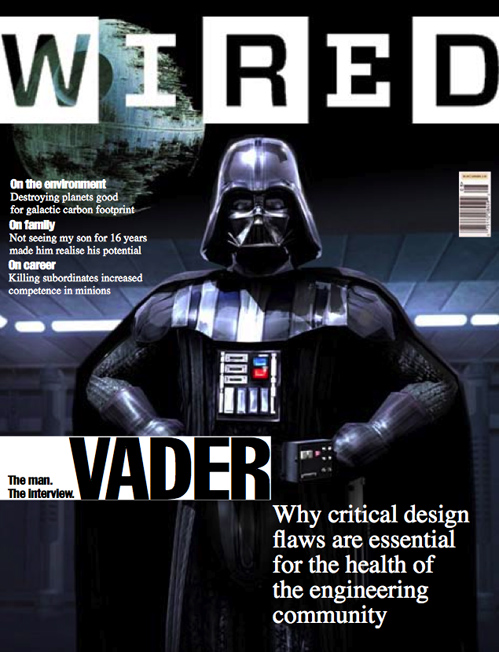
Dave Wiernicki (aka Perisoft), a regular wit in our Comments, delivered this stupendous effort to edge out the Victorian WiReD:
We particularly liked the attention to detail. The original WiReD carried a signature piece of smugness right under the masthead, which David has replicated.
Awesome work, sir.
Thanks to everyone who submitted a cover. Apologies if your submission fell down behind the back of the sofa or was confiscated by the Obscene Publications Squad. Mail us here with your particulars to get a completely worthless prize. ®