Original URL: https://www.theregister.com/2007/06/11/review_htc_touch_smart_phone/
HTC Touch Window Mobile 6 smart phone
Look but don't - despite the name - touch
Posted in Personal Tech, 11th June 2007 09:30 GMT
Review Apple's iPhone: still unavailable but nonetheless casting an enormous shadow over the smart-phone business. How, rival manufacturers ask, can we possibly respond? If HTC's new flagship phone, the Windows Mobile 6-based Touch, is anything to go by, the answer is imitation, not innovation.
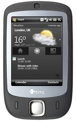
HTC's Touch: slick looks
You can easily imagine HTC's engineers eagerly examining the first iPhone pics and writing out a checklist of features to include in a rival product: touch control, snazzy user interface, fancy graphics and cool design.
Well, they go the last one right: the Touch is stylish. It's kitted out in rubber-feel matt black with a chrome-like, slightly concave band separating the front from the back. The latter is home to a two-megapixel camera ringed with with milled chrome and, nearby, a mesh-covered speaker.
Turning the Touch round - something its curvy, comfortable-to-hold casing makes you want to do again and again - there's the 2.8in, 240 x 320 touch-sensitive screen overlaid with a sheet of clear plastic that makes the display seem to fill the front of the phone. It doesn't, but it's amazing how this design trick makes the display look so much bigger than it is. The pictures don't do it justice.
Above the screen is the earpiece, again covered in a mesh grille that's cunningly placed so that the Bluetooth, WLAN and cellular indicator LEDs shine through as a series of parallel points of light - very cute.
Below the screen is a curvy square five-way navigator control equidistant between the widely space minimalist backlit call make and break keys. The Touch's other controls are fitted within the encircling chrome band: power key on top; camera button and the hatch for the SIM and Micro SD card slots on the right; mini USB and microphone on the base; and the volume control on the left.
If you could see the Touch suspended within a display case, slowly rotating under spotlights, you'd be hooked immediately. It looks stunning. You want to touch it, you can't help yourself. And then you wish you hadn't.
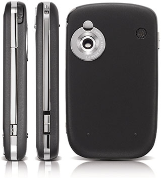
HTC's Touch: make sure you wear gloves...
We've never used a handset that's shows up fingerprints like this one does. By the time we'd taken the Touch out of its trying-too-hard packaging, inserted the battery and the bundled 1GB memory card, plugged it in to charge it up, and run through Windows Mobile 6's set-up screens, the Touch looked like we'd been using it for a month. The shiny sides show off fingerprints. The matt black casing really shows off fingerprints. And as for the screen, it really, really shows off fingerprints.
We have had this handset out of the box for less than an hour and it looks filthy. Yuk.
Now, it's easy enough to give the Touch a polish, but it doesn't take long before it needs another one. And since this a handset that's going to draw plenty of admiring looks - of that there's no question - it's going to need a lot of polishing. HTC doesn't include a rag in the box, though there is a screen protector, but that shows up fingermarks just as much as the screen does.
All of which is highly ironic given that this phone, as its name suggests, wants you to put your paws all over it.
Windows Mobile isn't particularly finger-friendly, but HTC's attempted to make it so with a couple of tweaks to the standard WM user interface. The first of these you encounter is the Touch's Home screen, essentially a custom skin for the regular Today display and a good one too. It's divided into three screens, each selected from icons in the middle of the screen: Home, Weather and Launcher. Select one and you get the relevant panel above the icons - below them sit Windows Mobile's usual upcoming appointments readout.
With the Home panel's big LED-esque time display and the Weather panel's anti-aliased, thousands-of-colours graphics, not to mention the overall look of the HTC Today screen, the iPhone's influence is clear to see, but it's no less attractive for that. And easy to use: the buttons are big enough for fat-thumb tapping, which takes you around the new UI and through to the standard Windows Mobile apps it links through to.
The Launcher displays nine app-specific icons in a five by two grid, the last icon allowing you to delete pre-set icons. Remove any and they're replace by a plus sign which can be tapped to call up a list from which you can choose a new icon. It would be nice to have room for more apps and even a way of scaling the display to the number of icons you actually have in view, much like Mac OS X's Dock does, but HTC's Launcher is still a big, big improvement on Windows Mobile's teeny Start menu and the Programs window with its (still) jagged-edge, crude-looking icons.
Palm rightly likes to talk about how it's improved the standard Windows Mobile Today screen on its WM-based Treos, but HTC has shown it can do a much better job.

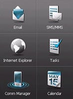
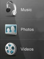
HTC's TouchCube UI: thumb-friendly access to people and apps
But HTC's TouchCube UI, the second of its Windows Mobile tweaks, is less successful. Described as a "three-dimensional, cubic user interface", TouchCube is activated by sliding a digit up the length of the screen starting at the HTC logo. It's said to be cubic because moving from one panel to the next is presented with a rotating cube effect pinched from Mac OS X's Fast User Switching feature, itself derived from Apple's Keynote presentation app. However, TouchCube only has three panels. We'll leave it to Register Hardware readers to email HTC and tell it how many sides a cube has...
The First panel presents a grid of nine spaces to add picture icons from your Contacts list, all arranged in a three by three grid above icons for the Phone and Contacts apps, along with another that lets you delete pictures, just as Launcher does with apps.
Moving your thumb left or right across the screen brings up the other panels. There's a media screen comprising three icons for Music, Photos and Videos, each calling up the appropriate Windows Mobile playback apps. The third screen presents six fixed icons for specific apps: Email, SMS/MMS, Internet Explorer, Tasks, Comm Manager and Calendar. Unlike Launcher, these icons can't be reassigned to other apps.
Dropping into Windows Mobile apps from TouchCube usually takes a couple of seconds, contributing to the Touch's rather sluggish feel. It has a 201MHz Texas Instruments OMAP850 processor which ought to be up for this kind of thing, and indeed it often is when you're just working in Windows Mobile. When you're done, you don't always exit back to TouchCube but to the HTC Today screen, and frankly this is where we suspect most Touch users will stay once they quickly tire of the TouchCube gimmick.
TouchFlo, HTC's touch-navigation system that underpins TouchCube, doesn't work with every app - you can't use it to thumb through Calendar day pages as you might a paper diary, for example - but it does allow you to pan and scroll through web pages, though Internet Explorer is initially set to display pages to the width of the screen. It also takes a while to get the hang of it - not helped by the need to flick your finger up along the screen to scroll down - but it's quite cute watching the page continue to slide by once you've let go, as if you were using a free-wheeling scroll wheel on a mouse.
The Touch has 802.11b/g Wi-Fi connectivity, incidentally, but we had real problems connecting to the internet through Reg Hardware's access point - something that's not been an issue with HTC devices before. In short, it wouldn't stay connected. That said, we had no problem connecting to my access point at home. In any case, turning off Wi-Fi and falling back on GPRS allowed me to connect as I'd expect to.
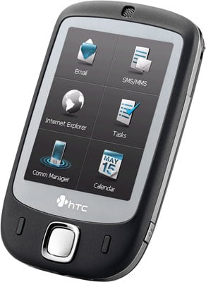
HTC's Touch: iPhone-esque graphics
The trouble with all this TouchFlo stuff is that it's only skin deep. Even LG's Prada phone has a UI that feels designed for touch control and not tacked on to another OS. Too soon you drop into the standard, ugly-by-comparison Windows Mobile 6 look and feel.
Pull out the stylus - yes, HTC still can't get rid of it - and the Touch is a decent, very compact Windows Mobile tablet-format phone. In fact, we found ourselves naturally grabbing the stylus and tapping away at WM's tiny links, alphanumeric pad and other UI elements that are just too small to hit reliably with fingers.
The Touch can be snapped up for around £350/$600, which isn't a bad price for a decent WM smart phone, particularly given there's that 1GB Micro SD card in the box and a reasonable set of earphones - which terminate, incidentally, in a tweaked mini-USB connector; there's no 3.5mm socket on the Touch. Once the card is in, it's almost impossible to get out, we found - no amount of prodding with the stylus - it's not just for text entry, you know - would get it to spring out.
The slot cover is almost as hard to open: unless you have girly long nails, you'll need to remove the Touch's back cover and pull the cover out by grabbing it near one of the hinges. To be fair to HTC, though, this isn't uncommon with small form-factor phones.
Call quality was good, so we've no complaints there. But the unit's battery life was nothing to write home about. HTC quotes five hours' talk time, but I'd say you're looking at charging the handset up overnight every night if you want to get the most out of the phone.
And the camera's rubbish. It may have a two-megapixel resolution, but shots are full of colour artefacts and look like they've undergone far too high a level of JPEG compression, so much so that they look like they were taken on a lower-resolution camera.
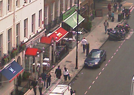
Sample shot at 100% size, cropped - click for full-size version
Verdict
What a disappointment. HTC's Touch is undeniably a smart-looking phone, but while it's a stunner in pictures, in your hands it quickly becomes a fingerprint-plastered mess. Yes, it offers some neat touch-control improvements on the standard Windows Mobile 6 user interface, but for all the fancy visuals, it's no iPhone.