This article is more than 1 year old
No pain, some gain: Ubuntu Oneiric Ocelot examined
Love it or leave it, Unity is here
Review Ubuntu 11.10, just released as its first beta differs only slightly in its looks from its 11.04 predecessor – a fact that will be welcome news to penguins still reeling from that earlier version's grand re-boot.
That earlier release shed GNOME 2.x, ignored GNOME 3.0 and set its brand-new Unity interface as the default.
Unfortunately, while the Unity desktop has potential, the initial release was rough enough around the edges that I suggested at the time waiting for a few more releases before embracing it.
While the first beta of 11.10, called Oneiric Ocelot, is also a little rough at the edges and features some curious design decisions, the version of Unity here is more stable and it is faster than the version that shipped with 11.04. In other words, Unity is making progress, albeit slower than many would like.

Dash changes: expanded capabilities with windows-style resizing
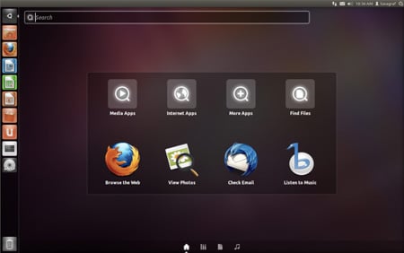
One of the areas that has seen a considerable makeover in the last six months is Unity's Dash. First and foremost, the Dash button has been moved from the top panel to the Unity launcher and its capabilities have been extended.
For example, there's a new music tab so you can start playing songs directly from Dash. Also, instead of the separate Places search tool, searching for files is now just a tab inside the Dash.
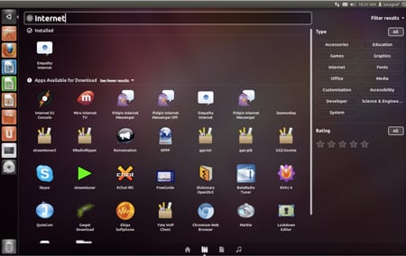
In fact, the whole "Places" metaphor from GNOME has been dumped in favor of what Unity calls "Scopes and Lenses." How the new metaphor makes more sense is anyone's guess, but at least your new "Lenses" have gained a quick filtering ability. For example, instead of searching for "Internet" to find applications that connect to the web, now you can just click the "Internet" filter. Similarly there are filters to refine your searches by date or tag.

Dash lets you search for objects and subjects with the aid of filters.
The Dash also now has its own window controls, so you can easily maximize or resize it to suit your whim, just like any other window in Unity. The visuals for the Dash have been updated as well, with a new transparency that looks vaguely like Windows 7. In another nice addition, the Dash will now, chameleon-like, automatically shade itself according to your desktop wallpaper.
Interestingly, while Dash gains window controls, full-screen windows have lost them in this release. Or rather the controls and menu items are now hidden and only appear when you mouse over the title bar. It's a small change, but one of those small changes that has people all riled up. In this case I'll side with those that call it unnecessary. If there were space saved, a few pixels even, it might make sense, but it doesn't save any space. As it stands the revamped title bar feels more like change purely for the sake of change than anything a user might call useful.
