This article is more than 1 year old
Kraft puts foot in big pot of yoghurt?
New logo maybe treads on Yoplait's toes
LogoWatch exclusive On 17 February, international nosh monolith Kraft revealed a new logo for Kraft Foods - a "global identity... that it hopes will drive the company forward in its second year of a three-year turnaround plan".
The result of a seven-month design process, the image boasts a "stylised red smile" encompassed by seven "flavour burst" icons each of which represents "a different division of Kraft’s business".
Accompanied by the slogan "Make Today Delicious", the revamped brand frontage represented a key part of Kraft's new “higher purpose”, as chairman and CEO Irene Rosenfeld put it to employees.
Kraft hoped that the "corporate identity shift" would create “clarity of purpose” and “enable a high performing culture".
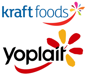 Well, The Register received an email on Monday suggesting that the new logo was somewhat less than delicious, due to an accidental similarity to that of the European tentacle of yoghurtmonger Yoplait.
Our source said that Kraft had decided to pull the logo, and is now using an "interim" version, minus the smile and flavour burst, pending the development of something else.
We note that the exciting new corporate paradigm shift is still available at Kraft's logo central, and a request for a statement yesterday had, at time of publication, gone unanswered.
For the record, the Kraft image overhaul was not well received by the unwashed masses. The blogosphere reacted with predictable hostility, with one commentator calling it "a design by committee nightmare", while the Denver Egotist described it as cramming "everything we hate about politically-correct big businesses into one two-inch space". ®
