This article is more than 1 year old
Motorola Z8 'kick slider' media phone
Does this 'multimedia monster' shape up?
Review After years of flogging the Razr to death, and some very uninspired siblings, Motorola finally has something interesting to offer for the more demanding end of the market. The Z8, announced in May and available in the UK this week, is a well-designed capable media phone. But the Z8 is a rare thing in this day and age: a product the manufacturer actually cares about.

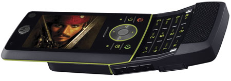
The most immediate eye-catching aspect of this phone is its "kick slider" design. This differs from a regular slider phone as the base contains a hinge - giving it its distinctive 'banana' shape when open. The hinge has some give, which means the phone flexes a little once it's open. This is disconcerting at first, but it's a practical design decision that you appreciate after some use. Without this flexing, the phone would be brittle and break easily.
Motorola says that by bringing the earpiece closer to your ear, and the microphone closer to your mouth, phone calls are more comfortable to make, as the Z8 fits the curve of your face. In fact, what makes the Z8 so comfortable to use is more about balance than shape. The phone's large 'chin' gives it a low centre of gravity, seating it firmly in your hand. Unlike other sliders, it doesn't feel like it's going to fly out of the top of your hand. This is one of the first sliders to feel like its natural state is open, not closed. Hats off to the designers here.
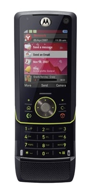
These folk also strived to give the Z8 a smooth look and feel: buttons are recessed beneath the surface of the case, and there's no gory connector at the bottom of the device. This doesn't always work to the user's advantage: the numeric keypad could certainly be more responsive. The call-end button trebles up as both the power button and the keylock. A mini USB port serves for both charging, PC connections and plugging in a headset.


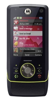
The Z8's other attention-grabber is the screen. With 16m colours on view, it isn't ground-breaking: but the quality, with the default font Motorola has chosen, is quite sensational. The balance of the aesthetics really works, unlike with Nokia's high-end models - where the text is either too large or too small - or the spidery lettering used by Sony Ericsson's own UIQ phones.
