This article is more than 1 year old
Microsoft's Surface Pro 2017, unhinged: Luxury fondleslab that's good...
... as in Veblen Good
And what didn't I like?
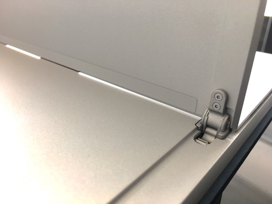
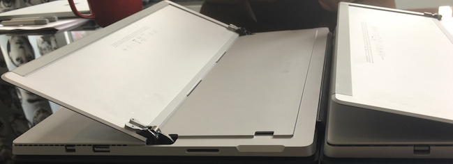
The 2017 Surface Pro has a redesigned hinge.
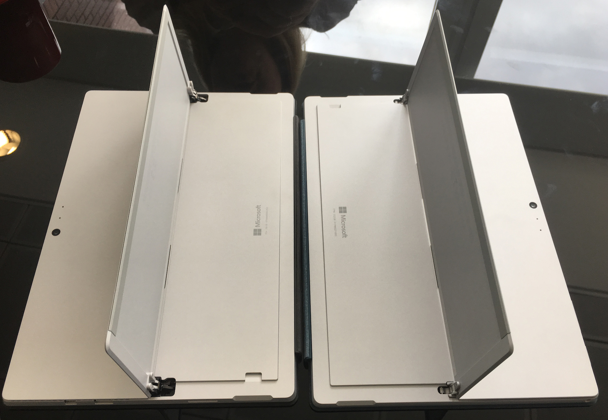
Surface Pro 4 and Surface Pro (2017) compared. The newer model lies flatter with the kickstand at its maximum extent.
Funnily enough, it's Windows 10. Microsoft invented the Surface to showcase Windows 8, which was a touch-first UI. It was a fairly clunky touch UI, but at least Metro or Modern apps written to the UI guidelines made sense. The problem of course is it alienated over a billion non-touch Windows users. So Windows 10 is keyboard and mouse first, and touch second. It's just a really awful second, and even though Windows 10 has been on the market for two years now, it remains botched.
Let me give you an example. My kids like messing around with a couple of Surface apps: Fresh Paint and a loops program, Music Jam. They could get around the Metro/Modern-style Fresh Paint but the design changes – Microsoft's own in strict accordance with its guidelines – made it much more unfriendly. The loops program shows just how broken it is.
In Windows 10 Metro/Modern functions are sucked into a menu which is invisible unless you exit Tablet Mode. So fundamentals like saving your song are invisible. Switch back to Desktop Mode and if you're lucky you'll spot the menu squirrelled away. Now I'm not advocating we go back to the Caligula era of Windows management and design, that was clearly a mistake, and the man had to go. But Microsoft just doesn't have the luxury of making such dumb UI decisions. A grown-up Peter Skillman (WebOS, Meego, HERE Maps) has been in charge of Windows design for coming up to two years, so we should start to see real as opposed to cosmetic ("Acrylic") changes filtering through. One of those should be making Windows 10 a decent tablet OS. Right now it isn't, and the app store looks worse than it did when the SP4 was launched.
A few tidbits of technical detail are worth noting.
The hinge now allows the stand to lie even flatter (165o, 15 more than its predecessor) and in practice, I found this made a surprising real-world difference, particularly when you're just browsing with the thing splayed out on your lap.
Although the Surface look otherwise identical, the inside has been redesigned around passive cooling. The m3 and i5 variants are completely fanless, and the i7 version, typically a hot air mover, was almost completely fanless. iFixit has a teardown confirming that it's even less upgradeable than before. "Microsoft has traded away the removable blade SSD for a little more battery real estate. There goes the sole upgradeable feature from last year's [sic] model," the site notes.
Battery life is claimed to be 13 hours but only for video playback. In practice, on the souped-up i7 model I received for the review, I got 5 to 7 hours, with "7-ish" being typical. But this is much better than before. It also seemed much more predictable. You can never really tell with the SP4 whether you're going to get four-and-a-half or two on the i5 model.
Conclusion
The 2017 Surface Pro is a swanky, show-off piece of kit that you'll find hard to justify. I like the form factor a lot, and long for a less fantastic and slightly more affordable Surface. But with Microsoft minting it in, that's not very likely. ®
