This article is more than 1 year old
Microsoft Lumia 950 and 950XL: Clear thoughts of Continuum with a snazzy camera
Sadly, these are for the collectors and diehards only
Windows 10 Mobile. It doesn't feel like Windows
We'll save our deep dive into Windows 10 Mobile – the biggest change to Microsoft's mobile platform for five years – for a separate piece. What you need to know here is this: in some respects, it's superficially similar to Windows 8.1. There's no new shell or launcher in W10M. But many "experiences" are now quite different.
Email and web browsing take a leap back, with two very buggy replacements (Edge and Outlook Mail) for the serviceable and slick Windows Phone 8.1 Internet Explorer and email.
Typing messages, even on a Snapdragon 810-powered machine, feels like wading through treacle. It's the only platform not to have a unified inbox. You've lost the invaluable "History" tab from the contacts ("People") app, and Windows Phone has gradually shed the deep integration it had at launch five years ago. Where WP8.1 "filled in" a contact photo from a social network, now it shows a blank.
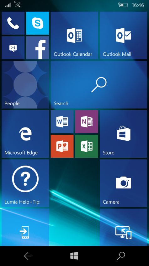
The 950 default Start screen
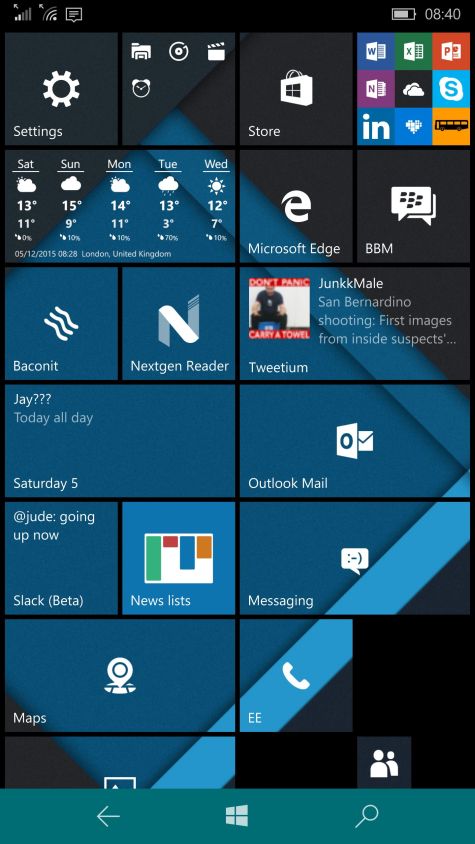
More Tiles can be fitted onto the 950XL Start screen, but not the 950, even though both phones have the same 1440 x 2580 resolution
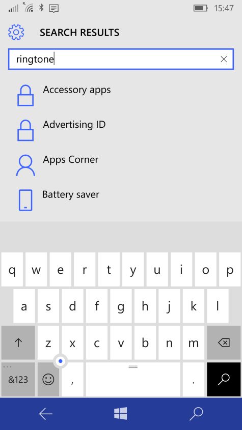
Thanks, Help! A search for a basic setting can be fruitless
Aesthetically, the design is a mess, with genuine confusion caused by the inconsistencies. Even as a very experienced user of Windows Phones I was left guessing where a particular menu options might be hiding. In some cases, it's hard to believe that some decisions made it out of the door.
The wireframe icons are very hard to distinguish apart, while the People app now features your friends and acquaintances heads on rotating circles, a positive school project of a Tile design. Overall, the end result is that Windows 10 Mobile feels like the designers had to follow moving targets, or perhaps competing product teams were forced to make shotgun compromises.
The root cause, however, is well known: it's an attempt to "unify" PC and phone UIs so that applications can run across both, and adapt to each display size and use case.
I'm not sure even that has been achieved; Windows 8 for PCs (c.2012) and Windows 7/8 (2010-2012) are unmistakably part of the same family, even though there were three APIs and development paths, because the design is so distinctive. Windows 10 Mobile feels less like Windows than any Microsoft product has.
Much of the pain today is the result of long overdue product rationalisation at Microsoft. For example, the company was maintaining six app Stores across different platforms, but now works off one code base. That's perfectly justifiable, and the ambition for Universal apps, and encouraging web and iOS developers to port easily to Windows 10, is both lofty and admirable.
But for now the end user gets the shitty end of the stick, while the benefit, such as it is, accrues to the producer. It's rather as if a Soviet tractor factory requests applause for an internal reorganisation, when all the farmers want is tractors that don't break down.
It's rather as if a Soviet tractor factory requests applause for an internal reorganisation, when all the farmers want is tractors that don't break down
