This article is more than 1 year old
Swedish National Font marches to the sound of whalesong
Flying the flag in 'audacious' rebranding
LogoWatch A Strategy Boutique tasked by the Swedish government to come up with a new brand identity for the land of Abba and surströmming has spunked God alone knows how much wonga to create a "global brand identity" comprising the country's flag and the word "Sverige".
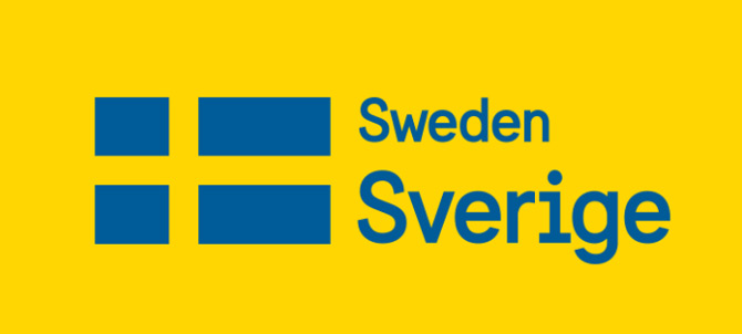
Key to the new brand frontage is the cunning use of Sweden's flag to represent the country. Mattias Svensson, creative director at "Strategic design agency" Söderhavet explained: "We tried every possible permutation of every possible symbol, from crowns to crosses to abstract shapes, but we always came back to the flag.
"It’s audacious to choose such an obvious symbol as the foundation for an identity, but I’m proud we did so — the flag will be just as relevant 20 years from now as it is today."
We'd suggest that only a man who's succumbed to an excess of joss-stick fug would suggest that choosing Sweden's flag to represent Sweden might be described as "audacious".
Söderhavet did make some effort to justify its fee in knocking up a new National Font to accompany the graphic, dubbed "Sweden Sans". Mercifully, neither the agency nor the man responsible – the country's "best-known font designer", Stefan Hattenbach – felt the need to crank up the whalesong and explain the deeper meaning behind the audacious typeface.
Svensson said of the overall rebranding experience: "We've given Sweden some great long-term identity building tools. In the meantime, this assignment has taught us much about place- and nation branding, and it has really whetted our appetite for more such projects in the future."
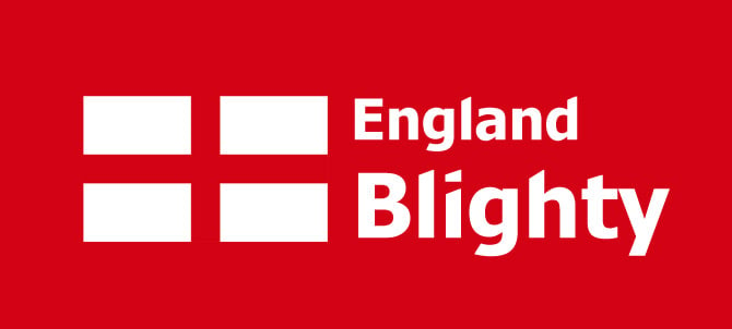
God preserve us. Lest English readers fret that Söderhavet might one day find itself involved in a makeover of our own global branding presence – and let's face it, we've got previous form in handing large amounts of cash to Swedes for absolutely no tangible benefit – we've launched a pre-emptive strike with this audacious concept, lovingly hewn from the living flag and featuring a custom "New England Patriot" font - all for a total cost of a few pints and a couple of pork pies:
®
