This article is more than 1 year old
Is it a bird? Is it a plane? Is it ... Win Phone 8? No, it's APPLE'S iOS 7
Arr, 'tis colourful. Belike Microsoft weren't lubbers after all
Is that support for smartwatches I see?
Alas these Control Centre app triggers can’t be changed - I guess Apple has decided we have the dock for that. But at least CC is also home to music controls, AirPlay media routing and AirDrop, and the new-to-iOS-7 Bluetooth-initiated device-to-device file-transfer system. In all, CC is a useful tool that’s not so much new as simply expanded and made more accessible in the new iOS build. Which is essentially the real theme of iOS 7, more so perhaps than the flight from skeuomorph.
This is true of the new multitasking menu, too; still reached through a double-tap of the home button, or swiping up with four fingers on an iPad. Gone is the series of dock-height pages of icons of running apps as seen in previous iOS incarnations. It's been replaced by an Android-style gallery of app windows, the app icon beneath each one, which orientates correctly whichever way up you hold the tablet - though it’s portrait only on the phone. There’s no question it’s easier to spot unwanted backgrounded apps now - likewise to remove them: just drag the app’s image upwards off the screen.
I was never a big user of iOS’s Notification Centre - which is where little icons announcing incoming emails, texts, reminders and other things are listed. It just seemed to duplicate information supplied in other ways. The new version is no different in that regard. Swiping down from the top of the screen to invoke it is no easier or more difficult than tapping on, say, the Weather app’s icon, or that of Mail, Stocks, Twitter or whatever, to get at the information required - especially since you often have to visit these apps anyway to read other messages that may have been pushed off the list by more recent notifications.

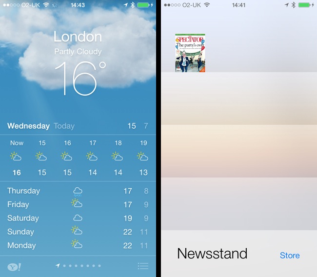
Weather gets pretty new (animated) images (left) but Newsstand is still around
Apple has made Notification Centre (NC) more useful, by turning it onto more of a "what’s happening today" readout reminiscent of Microsoft's Windows Phone OS, and it's got rid of that ghastly rotating block animation iOS 6 and its predecessor had. NC is tabbed, too, bringing together lists of all recent notifications and, separately, missed calls, which again doesn’t extend the feature set much but makes things on your phone more accessible.
Behind the scenes, iOS’s notification system has been rejigged to make it more readily available as a central clearing house for notifications. That will be a boon to smartwatch makers that have previously had to employ a range of techniques to extract notifications from a wide variety of apps. The modified NC engine makes it easier for software to file their own notifications, and it's much more straightforward for other apps and devices to access notifications, which can be routed out over a Bluetooth link to a watch or other device.
Notification Centre and Control Centre are available at any time, whether you’re on the lock screen, the home screen or in an app. Only the passcode entry screen lacks them, and they can’t be called up when dialogue boxes pop up on the screen. That’s true to the iOS 7 philosophy.
In addition to refreshing iOS’s graphics, Apple has thrown in a host of new tasty static wallpapers, not to mention a new and welcome set of ringtones and message tones, all with a more modern, abstract air. The old skeuomorphic samples of real-world objects - bells, car horns, typewriters and such - haven’t been ditched entirely though, but they’re tucked away at the bottom of the list in a sub-section titled Classic.
Groping your way through menus and controls ... Windows Phone 8 style
iOS apps typically organise pages of information and controls into a hierarchy that users can navigate back and forth through. This interface, which all Apple fans should be familiar with, is provided by the navigation controller component and the system's Settings app remains a steadfast employer of that mechanism.
In the new release, navigation controllers operate exactly as before, only now with a flat graphical design that’s no longer faux 3D. Gone too are the old bevelled navigation buttons at the top of these pages. Only the button’s lettering remains with a big arrow pointing out the way back. In fact, many icons have been replaced by plain text.

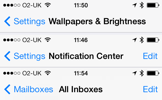
Textual buttons in navigation bars don’t always make for a neatly arranged interface
Ditching this graphical cruft in favour of simple labels is a plus point. But one downside is that you need some way to convey to the user that tapping on a bit of text will perform an action. Apple’s approach is to use colours: black for text, and a colour - any colour - for a button or link. Not that Apple is even remotely consistent in the use of this: some apps have wordy buttons, others retain icons, albeit freshly designed ones.
Colours or not, relying on clearly visible words rather than pictures also means buttons are now bigger and that brings another problem: messy layouts. Long lefthand-side buttons, typically used by navigation controllers to step back to the previous view, push the centrally aligned page title text to the right, or force it to shrink in size if there’s a righthand button that has to be accommodated. This isn’t a problem on wide devices like the iPads, but it’s very noticeable on the iPhone or iPod Touch.

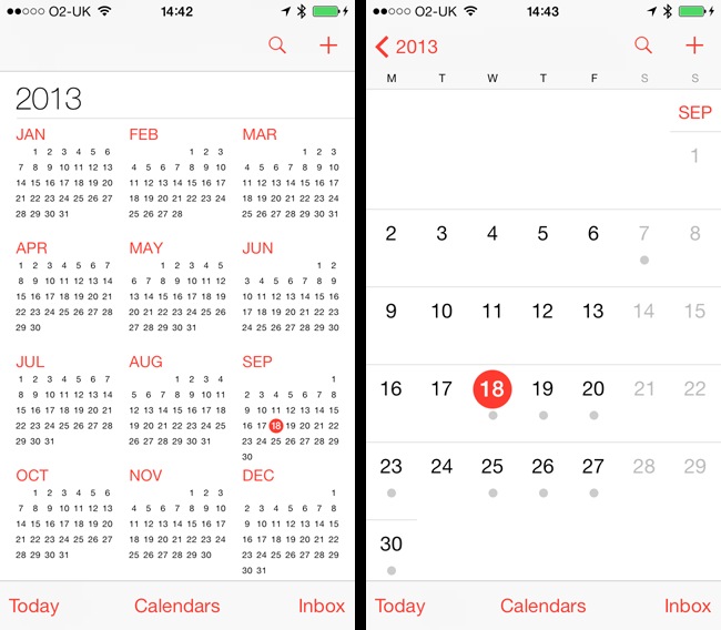
Calendar remains largely unchanged, but it does get a year-at-a-glance view and a more modern look
Swiping from the left pulls the current view off the screen to reveal the previous one - the equivalent of tapping a "back" button. Perhaps Apple hopes one day to drop navigation buttons altogether in favour of directional swipes. Some apps already do: Music, confusingly, employs rightward swipes to go from, say, a list of an artist’s albums to one of those album’s track list.
Music is one of just two iOS apps that appear to have had a lot of work done on them behind the scenes. In this case, though, the new version feels like a step back three or four generations. For example, the handy swipe right to delete an album - the way swiping right is used to delete emails in Mail - is gone, replaced by the aforementioned navigation gesture. If we’re all supposed to be pulling the tracks we want from iTunes in the cloud, surely we’ll need to delete some older albums now and then to make room for new downloads?

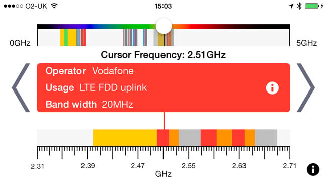
Apps are already being converted for iOS 7
I’m not going to suggest this is a cynical move to force some of us to buy a more capacious iPhone next time, but not being able to delete albums without hooking the phone up to iTunes on a computer is a usability failure. You can delete tracks, but who has the time to remove albums one song at a time? Music’s developers, presumably.
