This article is more than 1 year old
Microsoft Office 2013 heads for the cloud but fails to soar
Deep inside Redmond's cash cow: many improvements ... but ... yawn...
If you didn't like the Ribbon before...
One thing Microsoft did in Windows 8 was introduce the Ribbon UI into more applications, such as Windows Explorer and TextPad. Naturally, the new Office hasn't done away with the Ribbon, either. But once again, Office 2013's Ribbons look different than all of the other Ribbons we've seen before, breaking any sense of consistency.
In keeping with the overall Office 2013 UI, the new Ribbon is starker and less colorful, trading the more fully-rendered icons and controls of earlier releases for simplified ones. Whether you'll like this look better than the old one is a matter of taste.
The new Ribbon is also larger. Icons are spaced further apart to give the UI more visual breathing room, and to make them easier to use on a touch-enabled device.
The applications actually offer two Ribbon modes: one for a mouse, and an even roomier one for touch. In practice, though, switching to touch mode doesn't seem to do very much. In both modes, the new Ribbon takes up significantly more screen real estate than Office 2010's did.

The Ribbon UI in Office 2013 (bottom) takes up more screen space to display the same controls as Office 2010 (click to enlarge)
That's not necessarily a bad thing. The revamped Ribbon does look less cramped, and screen resolution is increasing both on PCs and laptops. But increasing the size of the Ribbon does seem like an awkward choice for smaller tablet screens.
Office 2013 does offer another option for users who don't want the Ribbon taking up any of their screen at all. Where earlier versions of Office allowed you to close the Ribbon so that only the menu titles were visible, the new version adds the ability to make the Ribbon auto-hide, so that it disappears completely until you tap where it should be.
Maximized and with the Ribbon hidden, an Office 2013 window becomes a pure document view with virtually no onscreen controls. It's an interesting idea, but the resulting UI is probably a little too Spartan for many users.
How many new features are there really left to add?
As usual, the new Office adds a variety of features to each of the applications in the suite. Many of these are relatively minor – which isn't surprising, given that Office is often accused of being bloated with features as it is. Some new features seemed like nice ideas but weren't very helpful in practice, and probably won't get used much.
Word 2013 introduces an improved full-screen read mode, with a touch-friendly UI that makes it almost seem like a Windows Store app. It automatically reflows text to present a rich reading experience, no matter what your screen size. To achieve this, though, it tends to resize images and other elements seemingly at a whim, so graphics often appear too small or are arranged strangely.
Another new feature is the ability to open PDF files and edit them in Word. This works fine for simple documents, but its support for PDF page formatting is highly limited and it didn't take long to find a PDF that it garbled badly. Think of it as you would an import filter for another word processing program, rather than as a true PDF editing capability.
The new Word also now lets you embed online video into documents, which can then be played back from within Word. Just who requested this rather dubious feature, I cannot imagine.
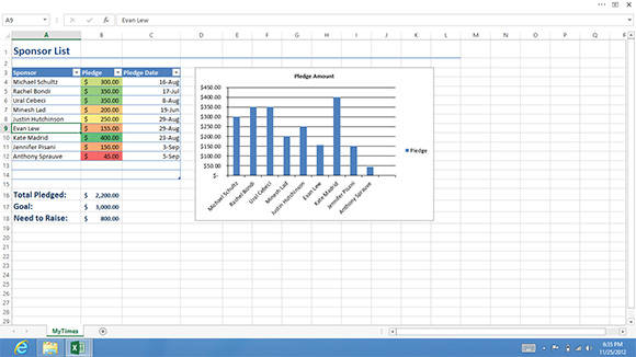
Excel 2013 introduces a number of new features, mostly aimed at making it easier for users to discover the tools they need to do what they want to do. For example, one new tool will recommend the best ways to summarize data into a PivotTable, while another will analyze patterns in your data to determine the best ways to present it as a chart.
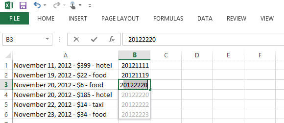
The "killer feature" for Excel 2013 is meant to be Flash Fill, which is supposed to help you fill out tables by guessing the correct values for the rest of a column based on patterns in the data you've entered so far. It's supposed to be useful for untangling data pasted in from other sources, for example. In practice, though, while Flash Fill made nice attempts, I found its guesses were usually off the mark (and on a spreadsheet, there's seldom such a thing as "close enough").

I'm not sure what pattern Flash Fill thought it detected here, but it wasn't what I was going for (click to enlarge)
The other Office apps mostly just add a few new editing tools and minor UI changes. PowerPoint 2013, for example, now offers various guides to make it easier to line up your artwork, and its Presenter View has been improved to make it easier to manage presentations on a second screen. Outlook 2013 can now connect to more types of email servers without installing any additional plugins. Other applications benefit from similar spit 'n' polish.

