This article is more than 1 year old
Forget 'climate convert' Muller: Here's the real warming blockbuster
Apply official WMO methods, warming shrinks massively
If new techniques endorsed by the World Meteorological Organisation are applied to official figures, over half of the global warming reported by US land-based thermometers between 1979 and 2008 simply disappears, researchers have found.
The new study used the same raw temperature measurements as US government federal scientific agencies, but the team deployed a revised metric that was better at taking into account the quality of the weather stations that housed the thermometers.
Previous studies have used a cruder metric to gauge station quality, which has to be taken into account so as to allow for the effect of asphalt, urban development and other local factors on the readings at any given thermometer. The new station-quality metric improves on older methods, not merely relying on distance but also the density of heat sinks and sources near the thermometers.
When the more sophisticated classification system is used, some dramatic results are seen. The new study reveals that the US National Oceanic and Atmospheric Administration (NOAA) discarded the temperature trend from the higher quality weather stations in favour of a warming temperature trend from low quality weather stations.
But the most extraordinary aspect is that this improved metric for categorising weather station quality has been endorsed by the World Meteorological Organization since 2010. It was proposed by Michel Leroy of Météo-France, the French state weather service, who devised its cruder predecessor in 1999.
Yet it has been left to a group largely outside the climate establishment to first do the field work and then the maths, and apply the new metric to the data. The official agencies and climate academics have been able (some would say, required) to use the latest WMO-endorsed categorisation method for 18 months, but have failed to do so.
Enter Watts et al
The new paper is co-authored by TV weatherman and blogger Anthony Watts, the Climate Audit blog's Evan Jones and Stephen McIntyre, and Dr John Christy from the Department of Atmospheric Science at the University of Alabama, Huntsville. Only Christy, who maintains the US satellite temperature monitoring network, can be considered part of the scientific climatology establishment.
The paper, titled An area and distance weighted analysis of the impacts of station exposure on the US Historical Climatology Network is detailed on Watts' blog here. The paper [PDF] [overview, methodology PPTs] relied on physical field work by hundreds of volunteers, who created a sample of US weather stations using the new WMO classification system.
A weather station is considered to be a source of high-quality data if it is compliant with this new categorisation system [PDF]. A compliant high-quality station therefore meets criteria such as its distance from obstacles, whether it is on sloping land, and whether the thermometer is regularly calibrated.
The team found that the most compliant, highest-quality weather stations reported a temperature increase of 0.155°C/decade over the period. This was much lower than the increase reported by non-compliant stations that were contaminated by urban effects including asphalt surfaces in their vicinity, which absorb the sun's heat during the day and act as a storage heater at night.
These contaminated stations reported an increase of 0.248°C/decade. Standard scientific practice would suggest that the trend from higher-quality stations gives a more faithful depiction of physical reality than data from lower-quality stations. Yet we're talking "climate science", here. In NOAA's official interpretation, the old crude metric is used, and the warming from all stations is given as 0.231°C/decade.
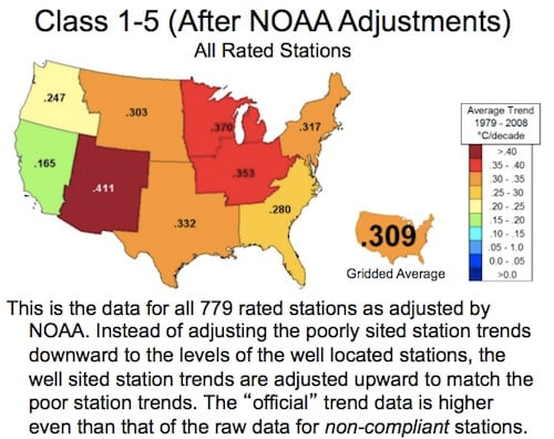
NOAA's trend map for the US from 1979 to 2008, highlighting the average 0.309°C/decade increase. Watts' comments are underneath
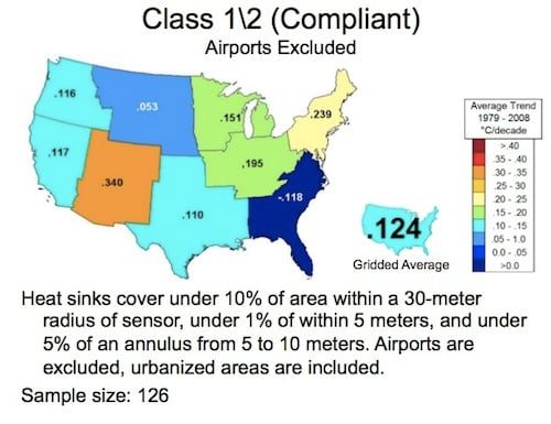
Watts' adjusted heat map for the country, showing the much lower increase in temperature (average 0.124°C/decade)
The tail wags the dog.
Strikingly, NOAA's reliance on low-quality thermometers is made clear when airport stations are examined. The WMO's new classification scheme means 601 of 727 airports examined in the sample are non-compliant and low quality: asphalt at airports means temperatures may be artificially inflated. When these non-compliant airport stations are excluded, the top-quality class 1 or 2 thermometers report an increase of just 0.124°C/decade, rather than the 0.308°C/decade NOAA insists upon.
So between 1979 and 2008 US land did warm, but not by as much as the official state agencies reported. Higher quality stations, less affected by growing urbanisation did not reflect the trend.
