This article is more than 1 year old
Office 15 steals OVERLARGE font, design vision from Windows PHO
NE
Large corporations which find themselves with an unexpectedly popular feature tend to go overboard with it. So it was with Java, which in the mid-1990s rapidly evolved from a programming language into an environment, then a platform, and then an embedded OS – so we got "Java for lightbulbs" - and finally a corporate philosophy.
In my view, Sun never quite recovered from having to repeat the WORA (Write Once Run Anywhere) creed. It lost sight of the fact that it earned its crust from people paying to run their applications on Sun's hardware and Sun's software. In its last few years as an independent company, you wondered Sun really wanted to do most – sell gear, or become a hippy NGO?
After years as the butt of industry jokes about user interface design, Microsoft has an unexpectedly positive reception to the "Metro" UI it introduced in Windows Mobile Phone 7. So it's sticking the Metro UI everywhere – including future versions of Microsoft Office.
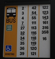
Microsoft says the Metro UI was inspired by public transport signs in Seattle, although I have my doubts. King Country bus signs are resolutely un-Metroish, and the design owes much more to modern magazine design. So the transit story sounds like a "backspiration" (the design version of a backronym).
Metro features tiles, lots of white space, and a font deliberately large, so large that it frequently OVERSP
ILLS the right margin of the page.
Rather than being considered a bug, this is apparently a feature. But all joking aside, the new WP design does work very well in practice.
Judging from the screenshot, the new design has removed most of the clutter that plagues Microsoft Office, using advice from the PJ O'Rourke handbook for bachelors on how to tidy a room: move everything to the side of the room, or under the sofa.

Office 15 gets lots of white space. pic: winrumours
[Click to enlarge]
Only testing will tell if it's as well received as the Phone UI revamp. But the Windows Phone isn't popular because of the typography, or even the tiles: it's popular because (like the iPhone) it makes a subset of very common tasks available and easy to access.
If it makes common tasks (even) harder to access, then it can't be considered a design success. The obstinate punter rules, here.
Microsoft Office 15 will also feature the now traditional No One Knows Quite What It Is™ application - following in the footsteps of Binder, and One Note. These applications typically bundle together files of a different type, and you need to install another Microsoft Office tool, or hire a Certified Professional, to unbundle it for you.
This one is called Moorea – of which there's more 'ere.
Office 15 builds began to float around late last summer, but since then the runaway success of the iPad has prompted Microsoft to make its next version of Windows much more tablet-friendly than it otherwise planned. Windows 8 will run on ARM chips, and work better with direct manipulation input, and touch. So it makes sense for Microsoft to design its key applications so they look better on a tablet too.
We must point out that 10 years ago Bill Gates predicted the tablet would become "the most popular form of PC" by 2007. Microsoft's idea of a tablet, though, was one that was so expensive and horrible to use, only a hardy few ever bought one. ®
