This article is more than 1 year old
Google threatens Chrome address bar with death
'Major' UI experiment vanishes urls
Google is exploring several "major" changes to the Chrome user interface, including a particularly compact user interface that actually hides the URL address bar when pages aren't loading.
In a recent post to the Chromium developer mailing list entitled "Major UI efforts", Google man Jeff Chang pointed to a public page describing four "window UI variants" for the Chromium OS project.
The first – known as "classic navigation" – is similar to the existing Chrome UI, but as Conceivably Tech observes, another layout receiving serious consideration – "compact navigation" – would be a significant departure from the browser as we know it.
Chromium is the open source incarnation of the Chrome browser, while Chromium OS serves as the basis for the upcoming Chrome OS operating system. Though the UI variants are intended for Chromium OS, Chang is writing on a Chromium mailing list and seems to indicate they'll be a part of Chromium as well. In any event, the two projects are meant to dovetail.
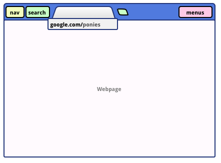
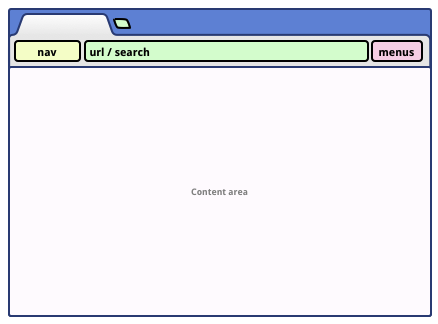
Currently, Chrome's URL address bar is always visible, alongside the navigation and menu buttons and just below your row of tabs. With the new "compact" design, navigation buttons are moved up alongside the tabs, and the address bar is only visible when a webpage is loading – though you can bring it back by clicking on the page's tab.
"If we take the address bar out of the tab, it can be used as both a launcher and switcher; the user doesn't have to worry about replacing their active tab," Google says. The UI looks something like this:

Chrome "compact" UI
The interface re-separates the search and address bars – the two are combined in Chrome's current Omnibox setup. With "compact navigation," the search box is moved up alongside the tabs and the navigation buttons. "Search can be used as launcher and switcher," Google says. But it appears that the search box will still be used for direct navigation – i.e., visiting a page by directly typing a URL. The UI simply hides the url itself after a page loads.
The setup saves vertical real estate, Google says, but the company also points out several weaknesses. You, well, can't always see the current URL. Navigation controls and menus are not located within the individual tab and "lose context sensitivity". And the tab strip gets "crowded".
Google's "classic navigation" option is far more familiar. "The most basic navigation style is that of a single maximized Chromium window. This is the equivalent of the Chromium browser windowing UI in maximized mode." It looks like this:

Chrome "classic" UI
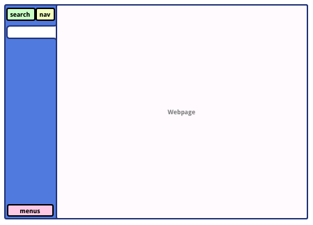
Google says that it's "focused" on these the classic and compact UI experiments, but two others are on the back burner. A "sidebar navigation" option puts the navigation buttons and address bar on the left-hand side of the browser. "By moving the tab-strip to the side, we gain a huge amount of real estate for tabs. The vertical alignment also allows for date ordering and grouping of tabs. By moving the address bar out of the tab and above the strip, it can be used both for navigation as well as search":

Chrome "sidetab" UI
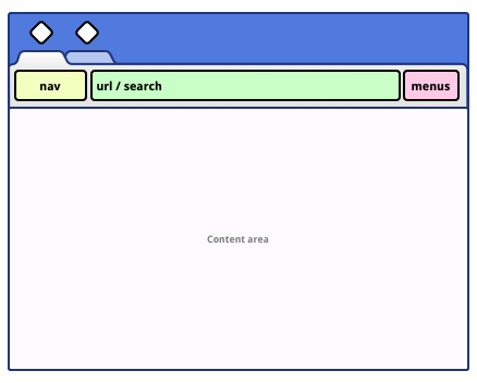
The company is also looking at a UI designed specifically for touchscreen devices. "For touch screens, we provide much larger tab and toolbar targets than on standard Chrome. This UI takes up more screen space, but is ideal for portrait devices, and can be autohidden to have full-screen content," Google says. "This treatment could be used on any edge of the screen, and it may be preferable to use the bottom edge depending on the device":

Chrome "touchscreen" UI
Google is also developing a means of allowing users to set up multiple Chrome profiles across separate Chrome windows, and these can be mapped to separate online Google accounts. "Allowing different windows to run as different Chrome identities means that a user can have different open windows associated with different Google accounts, and correspondingly different sets of preferences, apps, bookmarks, and so on – all those elements which are bound to a specific user's identity," the company says. "Having multiple profiles in the Chrome browser also makes it easy to browse with separate identities without having to log in as separate users at the operating system level."
This may include actually using a tag on the browser itself to identify the Google account currently in use:

Google's Jeff Chang indicated that the company has already "begun work on getting the profile selection widget to show up on the browser window frame." And he says that Google is working to allow users to associate separate browser preferences with separate Google accounts.
Currently, Google lets you synchonize your Chrome and Google account preference across multiple machines – an important part of its Chrome OS play. The new multiple profile will still allow for this sort of synchronization. "In the multiple profiles model, the idea of syncing will need to adapt to the understanding that several distinct users (or, at least, identities) can be associated with a single browser instance," Google says. ®
Update: This story has been updated to add additional information about the distinction between Chromium and Chromium OS.
