This article is more than 1 year old
Vodafone customers collaborate to chart coverage
Are you giving me signals?
If you think network coverage maps are untrustworthy and always favour the supplier, here's a way to to put them straight.
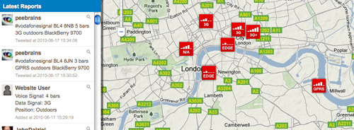
Vodafone has introducted a real-time UK coverage map, displaying the individual signals strengths of their customers.

Where's the best bars at?
It requires punters to send in this information. Twitter users can tweet details by entering #vodafonesignal followed by location, connection type, signal strength in bars, whether you're indoors or not and which handset model you use.
Sound confusing? Vodafone has released a short video to demonstrate.
Those who don't tweet can go through similar protocol in the "Not on Twitter" box to the right of the web-based application.
The map is updated live, showing customers how strong a signal is in a given area at particular moments of time. Of course, how useful all this is remains to be seen, but it's early days, and is arguably more relevant than a broadly coloured map of the British isles, which is usually how carriers show the extent of their coverage. ®
