This article is more than 1 year old
NASA's curious climate capers
Computer says: It's getting warmer
There have been a few red faces at NASA's Goddard Institute for Space Studies (GISS) in recent days, to match the predominant color of its October global temperature map. Based at Columbia University in New York, GISS is the division of NASA that is responsible for global climate data and is used by the media in assessing global warming. After analyzing the data, GISS reported that October 2008 was the warmest October since reliable record-keeping began in 1880. But there was something very wrong with the numbers.
Last week the October data started to be released. First, UAH (the University of Alabama at Huntsville) and RSS (Remote Sensing Systems) - the two groups that measure satellite data for lower troposphere - weighed in. The temperature anomaly for October was much the same as September, they reported approximately 0.2°C over the 1979-2000 average for each of those months.
But GISS, unlike UAH or RSS showed a startling jump, indicating the warmest October ever recorded.
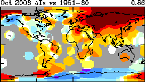
Hot all over: NASA's first attempt at October
Ironically for a space organization, NASA/GISS does not use satellites, but prefers to use readings from the surface stations of the National Oceanic & Atmospheric Administration (NOAA).
The map featured a huge red-brown area over Siberia that drew immediate attention. Readers from the blog run by metereologist Anthony Watts, WattsUpWithThat, soon determined what was wrong. The data for a large number of northern stations had their September numbers carried over to October.
After Steve McIntyre of the Climate Audit blog emailed GISS informing them of the error. GISS issued a new set of data the next day, with Gavin Schmidt crediting Watts' blog with spotting the error (while studiously avoiding mentioning McIntyre).
The revised map still showed Siberia to be fairly warm. England and Ireland were no longer in the red zone, while North West Canada was somewhat cooler. But the Hudson Bay area (previously not included) was filled in - in red.
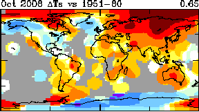
NASA tries again
The next day the data was adjusted yet again. The Hudson Bay data is removed (but NW Canada was "re-heated" to its original level). The Siberian hot spot was reduced, and the global anomaly stands - for now - at a whopping 0.25°C lower than their original announcement.
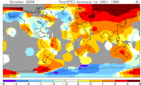
NASA's Third Attempt
NASA acknowledges the changes, but other than that provides no details nor any explanation whatever. The older versions of the maps are removed from their site. So why did neither GISS nor NOAA see fit to take a second look?
In all, September data from 90 stations was used in October. GISS director Hansen claimes that data analysis and quality control is rigorous:
Our analysis programs that ingest GHCN [Global Historical Climate Network] data include data quality checks that were developed for our earlier analysis of MCDW [Monthly Climatic Data for the World] data. Retention of our own quality control checks is useful to guard against inadvertent errors in data transfer and processing, verification of any added near-real-time data, and testing of that portion of the GHCN data
Yet despite receiving a federal budget of over $1bn for climate work, Schmidt admitted last week that only one quarter of a full-time employee checks the data.
"Current staffing from the GISTEMP analysis is about 0.25 FTE [Full-Time Employee] on an annualised basis (I’d estimate - it is not a specifically funded GISS activity)," wrote Schmidt.
On this occasion, neither GISS nor NOAA saw fit to take a second look, a curious response considering that results were such an outlier.
A history of warming
This latest episode is not the first time that GISS, under the authority of Hansen, has operated in an opaque manner. In 1999, GISS data showed the 1930s US temperature to be considerably warmer than that of the 1990s. But the current version shows the 1930s adjusted to a much lower level.
