This article is more than 1 year old
Painting by numbers: NASA's peculiar thermometer
What's the temperature, Kenneth?
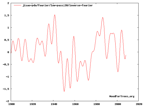
The NASA temperature map for March above shows Alaska temperatures much above "normal", while the UAH map shows Alaska temperatures well below "normal". This is partially due to the fact that the 1951-1980 NASA baseline period was unusually cold in Alaska - due to the cold phase of a dominant ocean cycle, the Pacific Decadal Oscillation (PDO), as shown below. The graph below indicates variations in Pacific temperatures, showing a cold period from 1950-1980 which exactly matches NASA's baseline period.

The Pacific Decadal Oscillation in its cold phase from 1951-1980 (the period of the NASA baseline)p>
When the PDO ocean pattern is in its cold cycle, the Pacific remains dominantly in the La Nina phase, causing cold temperatures - particularly around the Pacific basin. La Nina also causes cold northern hemisphere winter temperatures across much of the world - as measured in 2008.
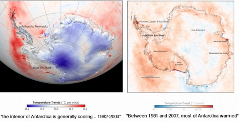
We can see how dramatic an artistic makeover can be. On the left, NASA's Goddard Space Flight Center shows that "the interior of Antarctica is generally cooling". Indeed, most of the landmass is cooler, or the same as it was, with patches of warming around the periphery.
On the right, NASA's Earth Observatory warns that "Between 1981 and 2007, most of Antarctica warmed" - and the graph is correspondingly crimson. For the colourists at the Earth Observatory, a mere +0.01C is needed to colour the continent red.
Conclusion
One month does not make a temperature trend, and the point of this article is not to ascertain whether or not the earth is warming towards Armageddon. We are not qualified to analyze that or second-guess the experts. What is being examined is the quality and stability of the data being used by people making those claims.
For example, whatever motivations NASA had for picking the 1951-1980 baseline undoubtedly have some valid scientific basis. Yet, when the data is calibrated in lockstep with a very high-profile and public political philosophy, we should at least be willing to ask some hard questions. Dr. James Hansen at GISS is the person in charge of the NASA temperature data. He is also the world's leading advocate of the idea of catastrophic global warming, and is Al Gore's primary climate advisor. The discrepancies between NASA and other data sources can't help but make us consider Einstein's advice:
"If the facts don't fit the theory, change the facts." ®
Credits Thanks to Evan Jones from Watts Up With That for pointing me to the USHCN temperature maps, and Steve McIntyre for generating them.

