This article is more than 1 year old
Painting by numbers: NASA's peculiar thermometer
What's the temperature, Kenneth?
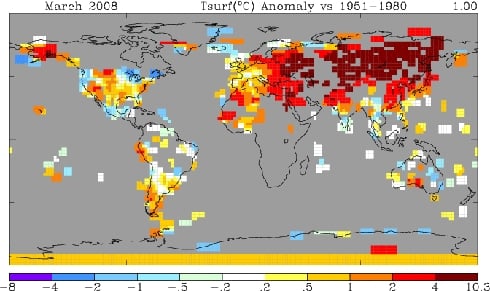
Viewing the NASA 250-mile map for March below, what immediately grabs the attention is that NASA has essentially no data (gray areas) in most of Canada, most of Africa, the Greenland ice sheet, and most of Antarctica. This begs the question, how can one calculate an accurate "global temperature" while lacking any data from large contiguous regions of three continents?
So what was NASA missing?

NASA Temperatures March, 2008 - 250-mile smoothing radius - looks hot
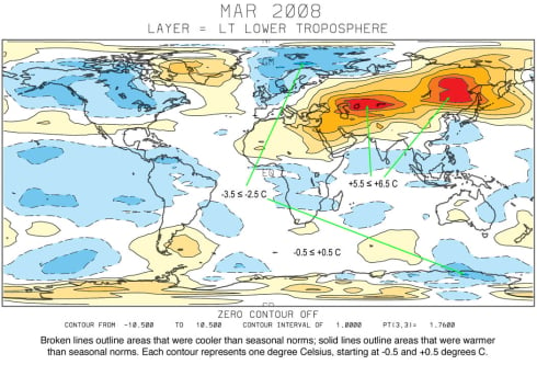
We can find NASA's lost continents in the UAH satellite data for March below.

UAH Satellite Temperatures March, 2008 - looks cool
Not surprisingly, the missing areas in Canada and Africa were cold. The NASA data thus becomes disproportionately weighted towards warm areas - particularly in the northern hemisphere. As can be seen in the UAH satellite map above, the warm areas actually made up a relatively small percentage of the planet. The vast majority of the earth had normal temperatures or below. Given that NASA has lost track of a number of large cold regions, it is understandable that their averages are on the high side.
Additionally, NASA reports their global temperature measurements within one one-hundredth of a degree. This is a classic mathematics error, since they have no data from 20 per cent of the earth's land area. The reported precision is much greater than the error bar - a mistake which has caused many a high school student to fail their exams.
Cherry picking
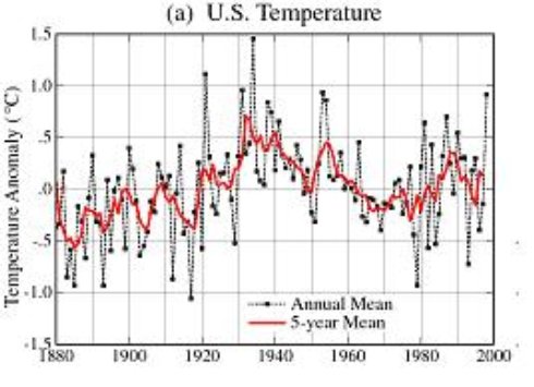
A second important issue with NASA's presentation is that they use the time period of 1951-1980 as their choice of baseline. This was a well known cold spell, as can be seen in the 1999 version of the NASA US temperature graph below.

NASA US Temperature Map August, 1999. Note the cooling trend since 1930, and particularly between 1951 and 1980.
Temperatures dropped enough during that period to trigger concern about the onset of an ice age. Newsweek magazine went so far as to mention a proposed "solution" of spreading soot in the Arctic to melt the polar ice caps. 1978 was the coldest winter on record in much of North America. By using a cold baseline, all recent temperatures become relatively warm - which causes the NASA maps to be covered with lots of hot red and brown colors. From looking at the NASA map above, one could easily believe that that the earth is having a meltdown. By contrast, the UAH map makes most of the earth look quite cool.
When we look at the temperature data for Alaska, the disparity is again quite striking.
